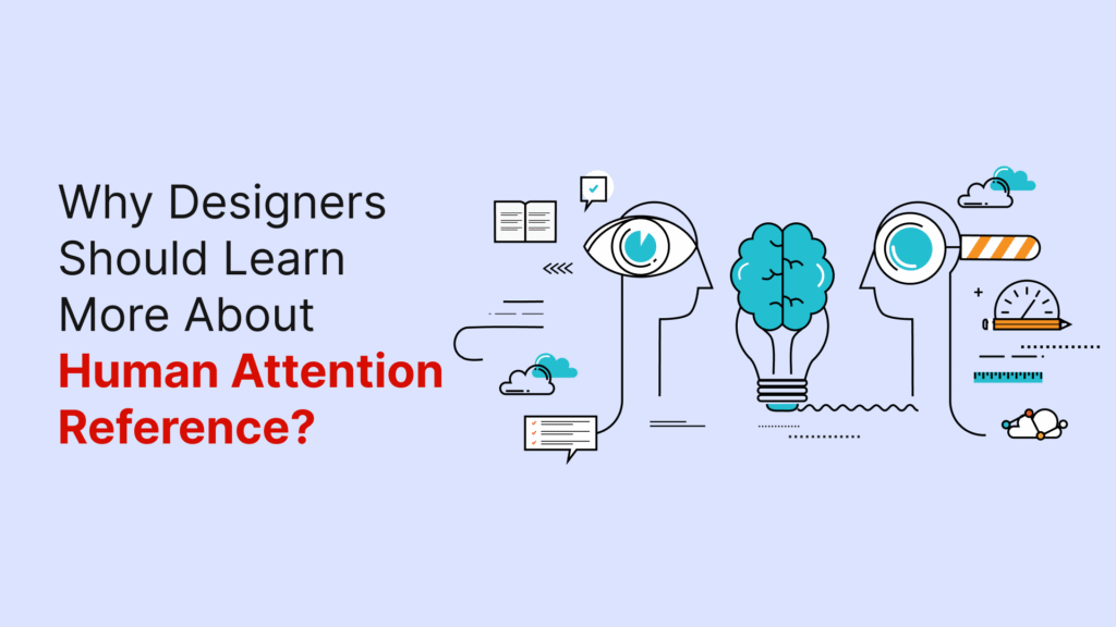
The human brain’s ability to pay attention is nowhere near what we might expect. Every second, our brains receive around 11 million bits of data, yet we can only process about 50 bits during conscious tasks like reading or designing. This means we process less than 0.001% of incoming information. A Microsoft study revealed that people’s attention spans dropped from twelve seconds in 2000 to eight seconds in 2009 – even a goldfish can focus longer at nine seconds.
This limitation creates a vital challenge for designers. We compete for scarce mental resources when we create digital experiences. The human brain’s attention span keeps shrinking as digital distractions grow. Understanding how attention works is significant to create effective human-computer interaction. Designers must remember that attention is a limited cognitive resource. Hick’s Law shows that more choices increase cognitive load, which affects how users interact with designs.
The science behind human attention span, its evolution over time, and design principles that align with these cognitive limitations will be explored in this piece. These principles help create better user experiences that work with our brain’s natural capabilities.
Understanding Human Attention
The way we process information in our complex world depends on attention. Many people think attention is a single process in our brain, but it actually comes in several different types:
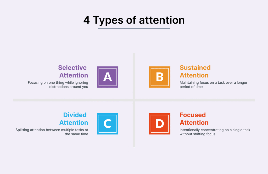
Types of attention: selective, sustained, divided, focused
Scientists have found that there are four main types of attention.
Selective attention helps us concentrate on specific things while blocking out distractions. Sustained attention lets us keep our focus for long periods, typically 15-20 minutes for adults. Divided attention lets us handle multiple tasks at once—what we usually call multitasking. Focused attention is our first response to things happening around us, which some scientists call orienting.
How attention and working memory are connected?
Working memory and attention use the same pathways in our brain. Scientists at Princeton found that there was a connection – the same neurons in the prefrontal cortex that process what we sense are similar to those that handle working memory. Our brain needs to pay attention to information before it can move into working memory. These systems both have limits on how much they can handle, with attention typically limited to 3-6 items.
The role of attention in human-computer interaction (HCI)
Understanding how people pay attention helps create better computer systems. Today’s interfaces need to work with different attention levels—from complete focus to background awareness. Designers can create better experiences when they understand attention’s natural limits instead of working against them.
The Attention Problem Designers Face Today
Designers today face a tough battle to capture user attention in an increasingly crowded digital world. Our environment has never been noisier, and people must choose what deserves their attention in their overstimulated daily lives.
Too many stimuli, too little focus
Life bombards us with many stimuli every second that compete for our limited attention. Modern interfaces often overwhelm users visually—social media platforms flood users with endless streams of content in a single scrollable feed. This information overload adds to cognitive load, and users miss critical information and make poor decisions despite having access to plenty of information.
How digital environments compete for attention?
Getting consumer attention boils down to supply and what people just need. People spend roughly 13 hours daily with media, yet most browse the internet or apps while watching TV. New content caters to shorter attention spans, and programming executives tell writers to assume viewers will use two screens at once.
The myth of multitasking in design contexts
Multitasking gets praise as a strategy to handle multiple tasks, but research shows it’s actually a myth. Our brain cannot process tasks that just need similar cognitive resources at once—we simply switch between tasks. This constant movement between tasks creates errors, reduces efficiency, and increases stress. Research reveals that multitasking can reduce productivity by 40% and hurts cognitive performance. Designers face a crucial challenge—they must create interfaces that work with human attention’s limits rather than fight against them.
How the Brain Filters Information?
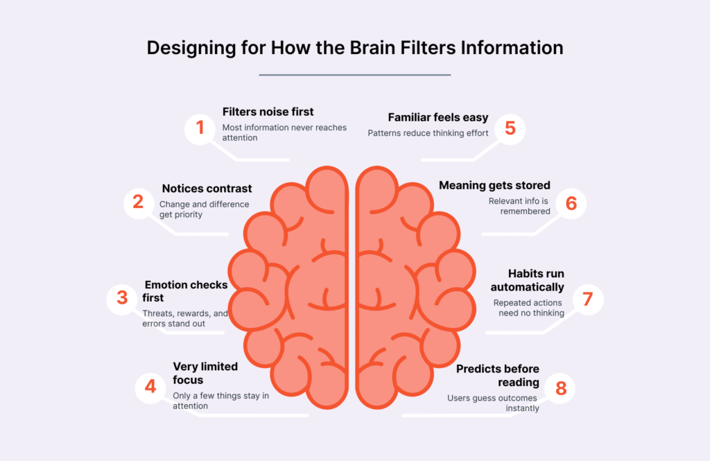
The human brain works more like a filter than a processor. Our senses flood the brain with millions of signals that need sorting at any moment.
The human brain attention span and its limits
Research shows our brain gets about 11 million bits of data each second but processes only 50 bits during conscious tasks. People’s filtering abilities have gotten worse over time. The average person’s attention span dropped to 8 seconds in 2009 from 12 seconds in 2000. This happens because attention acts as a guard that stops our brain from getting overwhelmed.
Working memory and attention bottlenecks
Neural mechanisms connect working memory and attention closely. Both face strict limits – working memory can only handle 7 items (give or take 2) at once. This creates a bottleneck since our brain can’t handle multiple complex tasks at the same time. What we call multitasking is actually our brain switching faster between different tasks.
The cocktail party effect in digital design
The cocktail party effect shows how we can focus on one conversation in a noisy room. Users demonstrate this same skill in the digital world by finding their way through busy interfaces to reach their goals. People navigate websites better when they know how to ignore distractions and focus on relevant links. This selective focus explains why we notice things that matter to us, like our name, even in cluttered environments.
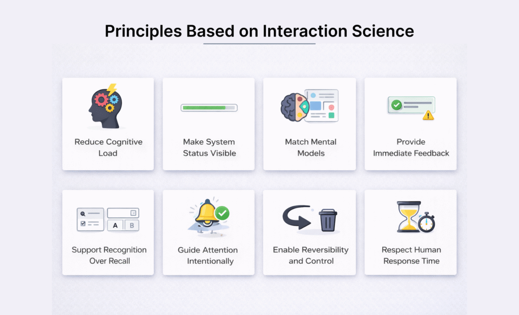
Design Principles Based on Attention Science
Good design aligns with how our brains work rather than fighting against it. Designers can create better interfaces by applying scientific principles that naturally guide human attention.
“Problems with visual design can turn users off so quickly that they never discover all the smart choices you made with navigation or interaction design.” — Jesse James Garrett, UX Designer and Information Architect, founder of Adaptive Path
Use of visual hierarchy and contrast
Visual hierarchy guides users through information based on importance. Larger elements naturally grab more attention than smaller ones. The combination of color and contrast creates visual emphasis—bright, saturated colors catch the eye more quickly than muted shades. A good hierarchy typically uses three size variations at most and limits itself to two primary and two secondary colors. This prevents users from feeling overwhelmed.
Minimizing distractions and clutter
Studies reveal that heavily decorated classrooms make students lose focus and learn less effectively. The same applies to cluttered interfaces that make tasks harder to complete. Whitespace makes a powerful impact—it highlights important elements and reduces mental strain when used around key components. Information becomes easier to digest when revealed gradually through progressive disclosure.
Guiding attention with motion and sound
Our brains naturally focus on objects that move faster than the surrounding visual field. Motion needs careful consideration because it can easily distract users. Sound plays a unique role in maintaining engagement where visuals fall short—this explains why podcast listeners tend to stay until the end.
Designing for task-positive vs. task-negative states
Users switch between task-positive (goal-focused) and task-negative (browsing) modes. Task-positive users need quick search options with minimal distractions. Task-negative users stay open to suggestions and unexpected content discoveries.
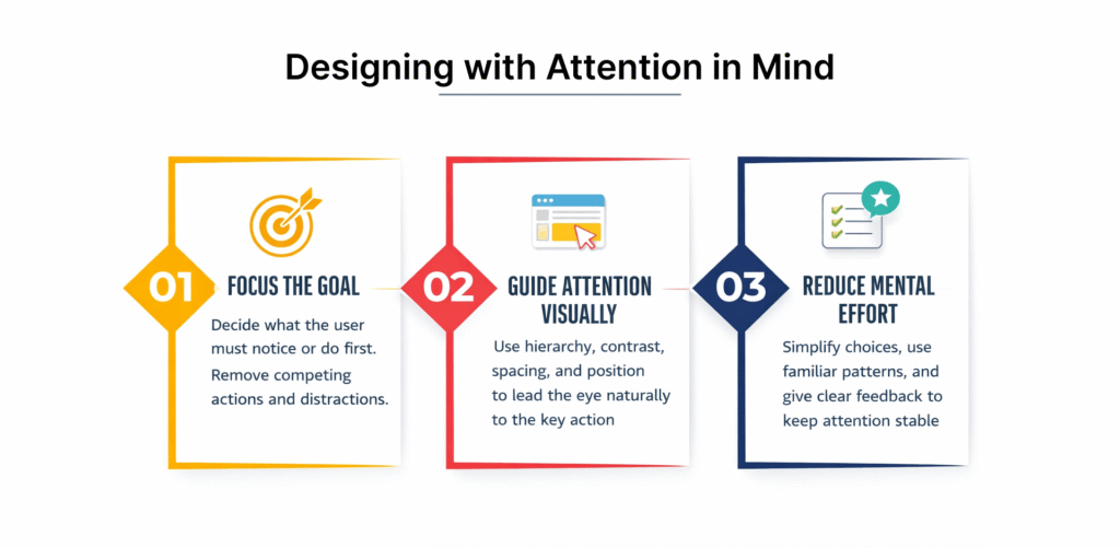
Designing with Attention in Mind
User-focused design must respect human cognitive limitations. Designers can create experiences that feel natural yet powerful by understanding how users process information.
Simplify interfaces to reduce cognitive load
The mental effort needed to process information in working memory defines cognitive load. Designers should reduce unnecessary cognitive load from poor design choices. Forms represent most important mental work. A logical content organization creates a clear completion path. Progressive disclosure helps prevent overwhelming users and reveals only essential information at each step. Content becomes more focused when whitespace allows it to breathe.
Use familiar patterns to support user focus
Jakob’s Law tells us that users expect websites to work as with others they visit often. Interfaces become more accessible when they follow familiar design patterns. Users apply knowledge from past experiences to new but similar situations. This familiarity lets the interface fade into the background, and users complete tasks smoothly.
Design for sustained attention in learning environments
Knowing how to maintain focus, control impulses, and block distractions defines sustained attention. Learning environments need minimal visual clutter since research shows decorated spaces increase off-task behavior. Information should be broken into smaller, digestible parts. Users understand their progress better with clear indicators of completed and remaining steps.
Apply HCI principles to guide user behavior
Human-Computer Interaction explores people’s interactions with computers to streamline processes and usability. The foundations of HCI include consistency in layouts to minimize cognitive load, immediate feedback that confirms actions, visual cues suggesting functionality, error prevention, and accessibility.
Why Attention Matters in Design?
Understanding attention patterns gives designers a vital competitive edge as people’s attention becomes harder to capture. Research shows clear patterns that affect design’s effectiveness.
“Good design is obvious. Great design is transparent.” — Joe Sparano, Design Professional and Educator
The average human attention span is shrinking
People’s ability to focus has dropped dramatically over the years. Research from 2004 showed our attention span on digital screens lasted about 2.5 minutes. This number fell to 75 seconds by 2012. Today, it sits at roughly 47 seconds. The median time is even lower at 40 seconds—half of all people have shorter attention spans. This trend shows up in online content of all types, and prominent topics get less collective attention over time.
Cognitive overload and its effect on user experience
Users face cognitive overload when interfaces ask too much of their mental processing power. This state guides them toward more mistakes, frustration, and inability to make decisions. Mental strain kicks in whenever content becomes hard to process. Long paragraphs and messy hierarchies make users work harder than they want to. Users’ stress levels rise noticeably under these conditions. Heart rate monitors show increased stress during frequent task switching.
Attention span for learning vs. browsing
The quality of attention changes based on context by a lot. Screen time directly affects children’s concentration. Kids aged 2-4 spend about 2.5 hours daily on screens, while 5-8 year-olds use them for roughly 3 hours. Learning environments need special attention to these limits since children must control themselves to learn effectively. Brief exposure to hyperlinked websites reduces concentration immediately. These effects last even after people stop using the internet.
Tools and Techniques to Capture Attention
Design experts use powerful techniques to guide human attention through complex digital worlds. These tools change how users connect with interfaces and create more user-friendly and engaging experiences.
Use of microinteractions and animations
Microinteractions are subtle trigger-feedback pairs that respond to user actions through small, contextual interface changes. These tiny moments have four key parts: the trigger (user or system initiated), rules, feedback, and loops. They provide quick feedback, show system status, and stop errors while showing brand personality. A pulsating heart animation when users like content shows this well—it confirms the action without distracting from the main tasks.
Color, contrast, and spatial positioning
Contrast works by creating differences between elements in a composition. Elements become easier to understand as these differences grow. Our brains process visual information before we become aware of it, and high-contrast elements catch our eye first. This explains why contrast works so well. Strategic positioning creates strong contrast too—elements placed away from similar objects naturally grab attention. These techniques create focal points that hold viewers’ attention through visual differences.
Progressive disclosure and content chunking
Progressive disclosure shows only key information at first and reveals more details when needed. Users can prioritize features better, which leads to fewer errors and improved efficiency. Content chunking splits information into smaller, digestible sections. Good chunking uses short paragraphs with white space between them, clear visual hierarchies, and organized groups of information. Both methods help users process complex information by respecting attention’s limits.
Conclusion
Understanding human attention is a vital foundation of design that works. This piece explores how our cognitive limitations affect user interactions with digital interfaces. Human attention spans have dropped from twelve seconds to eight seconds, while our digital world grows more complex.
Design professionals face a tough challenge. They must build experiences that align with human cognition instead of fighting against it. Visual hierarchy, smart use of contrast, and careful motion application help guide users through interfaces without taxing their cognitive resources.
On top of that, it’s worth getting into the myth of multitasking. People can’t process multiple demanding tasks at once—they switch between them and lose efficiency and accuracy. Good interfaces recognize this limit by offering clear paths and removing distractions.
Designers should adopt principles like progressive disclosure and content chunking naturally. These methods respect human attention’s natural limits while delivering meaningful experiences. Familiar patterns play a vital role too. Users can apply knowledge from past experiences rather than learn completely new systems.
The tools we looked at share one purpose. From microinteractions that give quick feedback to smart use of whitespace that cuts cognitive load, they help create interfaces that feel natural despite their complexity.
Designers do more than make things look good. They shape how people use technology at the time when attention has become our scarcest resource. Science-backed principles that respect human cognitive limits create more humane and user-friendly digital experiences.
The fight for attention will continue without doubt. But designers who understand how people process information can build interfaces that capture attention without draining it—striking a balance that helps both users and products they use.
Key Takeaways
Understanding human attention is crucial for designers as our cognitive capacity continues to shrink in an increasingly digital world. Here are the essential insights every designer should know:
• Human attention is severely limited – We process only 50 bits of the 11 million bits of data received every second, making attention a scarce resource.
• Attention spans are shrinking rapidly – Average focus time dropped from 12 seconds in 2000 to just 8 seconds in 2009, now averaging 47 seconds online.
• Multitasking is a myth – The brain cannot truly process multiple demanding tasks simultaneously; it switches between them, reducing productivity by 40%.
• Design with cognitive limits in mind – Use visual hierarchy, minimize clutter, and apply progressive disclosure to reduce cognitive load and guide user focus.
• Leverage attention science principles – Strategic use of contrast, familiar patterns, and microinteractions can capture attention without overwhelming users’ limited processing capacity.
When designers understand and respect these cognitive limitations, they create more effective, user-friendly interfaces that work with human nature rather than against it. The key is designing experiences that feel effortless while delivering meaningful functionality.
FAQs
Q1. Why is understanding human attention crucial for designers?
Understanding human attention is essential for designers because it allows them to create more effective and user-friendly interfaces. With the average attention span shrinking to just 8 seconds, designers must craft experiences that capture and maintain user focus without overwhelming cognitive resources.
Q2. How does multitasking affect user experience in design?
Contrary to popular belief, multitasking is actually a myth. The human brain cannot process multiple demanding tasks simultaneously, but rather switches between them rapidly. This task-switching can reduce productivity by up to 40% and increase errors, making it crucial for designers to create focused, streamlined interfaces.
Q3. What are some effective techniques to capture user attention in digital design?
Designers can use several techniques to capture user attention, including strategic use of visual hierarchy, contrast, and microinteractions. Progressive disclosure, which presents only essential information initially, and content chunking, which breaks information into smaller, digestible parts, are also effective in guiding user focus without overwhelming them.
Q4. How does cognitive load impact user experience?
Cognitive load refers to the mental effort required to process information. When interfaces demand excessive mental processing, it leads to cognitive overload, resulting in increased errors, frustration, and decision paralysis. Designers should aim to reduce extraneous cognitive load by simplifying interfaces and using familiar patterns to support user focus.
Q5. Why is it important to design for different attention states?
Users exist in either task-positive (goal-oriented) or task-negative (browsing) states, each requiring different design approaches. For task-positive users, efficient search functions and minimal distractions are crucial. Task-negative users, on the other hand, are more receptive to suggestions and unexpected content. Designing for both states ensures a more comprehensive and effective user experience.


