
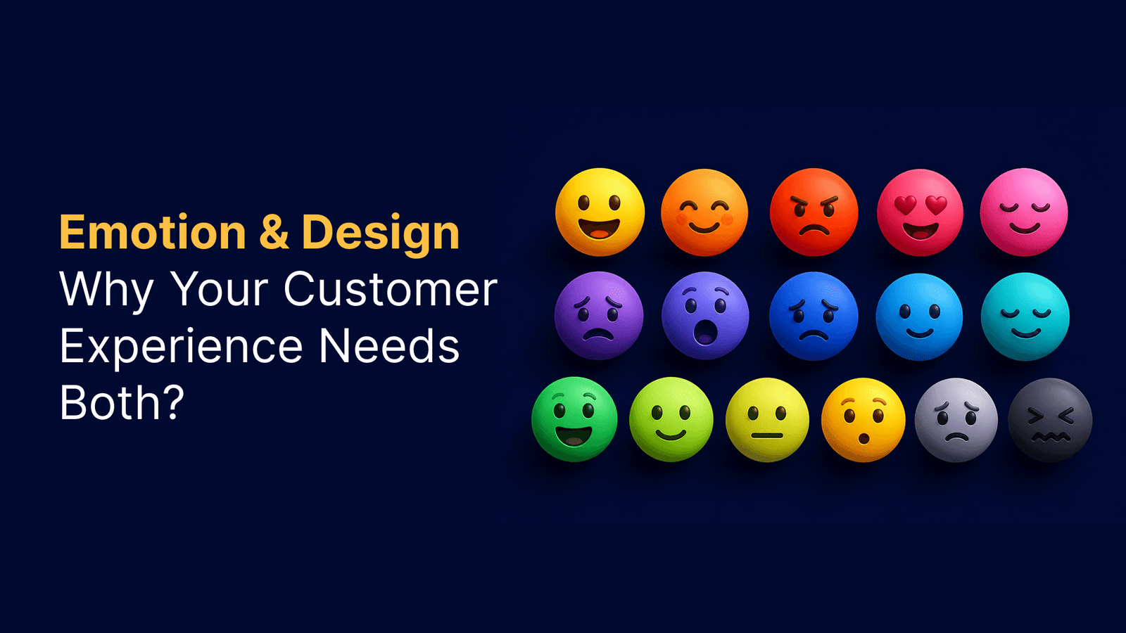
What is Cognitive Load in UX and Why It Matters?
→ Cognitive Load Theory
Our brains work like computers with limited processing power. Cognitive Load Theory, developed by psychologist John Sweller in the late 1980s, explains how we handle information when learning or completing tasks. The theory emerged from studying problem solving and expanded on earlier work about how humans process information.
In UX design, cognitive load represents the mental resources needed to operate your interface. Working memory can typically process 5 to 9 pieces of information at any given time. When information exceeds this capacity, performance drops. Users take longer to understand what they see, miss important details, or abandon tasks entirely.
Sensory memory filters what happens around us and passes select information to working memory for processing. Working memory then either discards the information or stores it in long-term memory structures called schemas. The more users work with these schemas, the easier recall becomes.
Cognitive load in UX isn’t just about learning how to use a site. Users must navigate layouts, understand transactional forms, and simultaneously track information relevant to their goals. When planning a vacation, for instance, users carry both interface knowledge and specific constraints like price and timeframe in their working memory.

→ Three Types: Intrinsic, Extraneous, and Germane Cognitive Load
Cognitive Load Theory identifies three distinct types that affect user experience differently:
→ Intrinsic load refers to the inherent complexity of the information users need to understand. This type correlates directly to task complexity and the number of elements requiring processing. An expert with existing knowledge schemas handles more elements easily than a novice. Understanding a complex infographic demands more mental processing than reading a simple headline-based webpage. We cannot eliminate intrinsic load, but we can control how it’s introduced.
→ Extraneous cognitive load covers any elements irrelevant to understanding the content but still requiring mental processing. Poor design decisions create this unnecessary burden. Cluttered layouts, excessive information on screen, distracting typography, and irrelevant images all generate extraneous load[5]. This type steals mental energy without contributing to user goals. Designers should eliminate or minimize extraneous load since it wastes the precious resource of user attention.
→ Germane load represents the productive mental effort users invest to make sense of information and build understanding. This load helps users organize information into structured schemas that make sense to them. Unlike extraneous load, germane load supports learning and should be encouraged after managing intrinsic load and removing distractions.
→ Impact of High Cognitive Load on Complex Products
When incoming information exceeds available mental processing space, users struggle to keep up. Tasks become more difficult, details get missed, and overwhelm sets in. High cognitive load creates several problems for complex products.
User engagement suffers first. Overwhelmed users experience frustration and negative experiences. When cognitive load exceeds capacity, users lose confidence and control. They may feel anxious or unable to process new information effectively.
Efficiency and productivity decline next. Excessive cognitive load hinders decision making and information processing. Users spend more time figuring out how to use the interface instead of accomplishing their actual goals. Even intelligent users can only process limited information at once.
Learning and retention take a hit. High cognitive load makes comprehending complex concepts difficult and affects how users remember task procedures. Cognitive overload occurs when intrinsic, extraneous, and germane loads combine to overwhelm users. They may fail at tasks that should be manageable given their knowledge and experience.
Accessibility becomes a concern too. Users with cognitive impairments or limited cognitive resources face particular challenges. Reducing unnecessary cognitive load creates more inclusive interfaces that serve a wider range of users.

Navigation serves as the backbone of any digital product. When menus become cluttered and information gets scattered, users spend mental energy just trying to find their way around. This extraneous cognitive load steals attention from their actual goals.
→ Reduce Menu Complexity and Depth
Long menus create a cognitive obstacle course. Every item demands attention, every option creates a micro-decision. Stack enough of these decisions together, and users feel overwhelmed. Their eyes dart back and forth, they hover uncertainly, they scan the same area twice. Sometimes they give up entirely and look for another way.
Start by removing duplicate features and links. Duplication adds significant overhead to both the scanning process and the comprehension process. Users don’t know for sure when a feature is duplicated, so they spend additional time figuring out whether the duplicate is a new feature or an old feature. This wastes precious mental resources.
Limit your menu items to avoid overwhelming users. For websites with no more than a dozen items, simple categorization works fine. But as products grow, organize navigation into crucial, optional, and irrelevant categories. Crucial categories matter to all targeted users and should appear first. Optional categories come next, after users have gone through the crucial ones.
Consider where secondary navigation belongs. Larger websites often need a second or even third navigation. You can place extra links in the footer for information that’s useful but not critical. Alternatively, use a bar above the header for valuable information like customer support or park hours that shouldn’t be relegated to the footer.
→ Use Clear Labels and Familiar Patterns
Labels make or break navigation. We often encounter products whose navigation labels sound nifty or on-brand but totally miss the mark on making sense to users. Labels like “Build, Manage, Learn” or “Ignite, Imagine, Inspire” might seem clever, but they confuse people.
Users need to understand their options immediately. Give them only as much information as they need. If labels are very familiar, they alone suffice. You don’t need large pictures and long descriptions to explain what “jeans,” “shorts,” “shirts” and “jackets” are.
Keep clarity and consistency top of mind. Use clear labels and familiar UX copy throughout the design to help users understand where they are and where they can go. Enterprise users might find it more natural to use nouns like “Settings, Employees, Analytics” instead of verbs. During user testing, ask someone to tell you where they think a navigation item will lead them. You want them to be right every time.
Maintain consistent structure across your navigation. When users move from category to category, keeping the dropdown menu structure the same prevents jarring experiences. Organizing main links and visual elements in the same way throughout creates a predictable visual rhythm and makes navigation more user-friendly.
→ Implement Effective Search and Filtering
Search functionality helps users quickly find information, something particularly vital in large or complex products. But search alone isn’t enough. Balance navigation and search because navigation needs to make up for users who don’t rely on search as much.
Filter-based search elevates the browsing experience for both active searchers and passive browsers. The challenge lies in finding the middle ground between too many filters and not enough filters. Your filters should be relevant to your business segment and users. Select categories based on understanding your users, their use cases, and the overall industry.
Display search result counts for each filter option. These counts should dynamically update every time a filter gets applied. This allows users to get to products faster and with fewer steps.
Make it easy for users to remove filters. They may accidentally select an incorrect value or find they’re no longer interested in their selection. Users should remove filters from their search without having to refresh the page or start over.
→ Group Related Features Logically
Take inventory of all your content across places and functionality. With everything mapped out, do a consistency check. Ask yourself where users came from to land on this page, what paths they could take to get here, and whether breadcrumbs make sense.
Group related pages together so people can easily find what they’re looking for. Aggregate and categorize the types of items in your product. This proper categorization simplifies both the designer’s work and the navigation experience for users.
Workflow-based navigation works when dealing with guided steps rather than exploration. For instance, a homeowner applying for financial assistance might need to “Learn About the Program, Upload Documents, Fill Application Form and Review Application” before they submit. This sequential structure reduces cognitive load in UX by breaking complex processes into clear, manageable steps.
Step 2: Apply Progressive Disclosure and Visual Hierarchy
Progressive disclosure reduces cognitive load by revealing information gradually as users need it. Instead of bombarding users with everything at once, this technique presents content in manageable chunks. According to Cognitive Load Theory, our brains can only process limited information at a time. By deferring non-essential details, we help users make decisions with less mental effort.

→ Show Information When Users Need It
The core principle behind progressive disclosure is simple: show users only what they need at any given moment. In essence, we hide advanced features and information in secondary UI components while keeping essential content in the primary interface.
Several UI patterns support this approach. Accordions expand and collapse content sections, reducing clutter while maintaining accessibility. They work particularly well for FAQs and forms where users select which information to view. Tabs divide content into panels but display only one at a time, letting users switch between sections without scrolling. Modal windows and popups open in front of the main interface to provide extra functions without losing context.
Tooltips reveal additional information when users hover over elements, providing context without overwhelming the primary content. For instance, Google Forms displays tooltips about responder permissions exactly when users add questions to their forms. Dropdowns and expandable sections help users access details without cluttering the screen.
When designing progressive disclosure, prioritize correctly. Identify critical features that 100% of users need and present them first. Less critical features that advanced users require come next. Make progression intuitive through buttons, links, and clear labels that set expectations. Most importantly, avoid creating more than two levels of disclosure, as additional levels typically harm user experience.
→ Use Size, Color, and Spacing to Guide Attention
Visual hierarchy determines whether users can scan a page and take action without friction. Size serves as the most direct way to establish importance. Larger elements naturally draw attention first, guiding users to key information. Headlines at 36-48px on desktop command more attention than body text at 16-18px.
Contrast draws the eye immediately. High contrast between foreground and background makes text readable and focuses attention on priority elements. Bright accent colors work for call-to-action buttons, while desaturated colors push secondary information to the background.
White space reduces cognitive load by giving the brain rest. Adequate spacing helps users focus on key messages instead of clutter, increasing comprehension and satisfaction. Studies show proper white space improves text readability by up to 20%. Spacing also communicates relationships between elements through the Gestalt law of proximity.
→ Break Complex Tasks into Smaller Steps
When tasks are broken into smaller steps, both the quality of finished work and the user experience improve. Breaking down large projects into bite-sized steps reduces stress and increases focus. This approach helps users identify the true first step, avoiding situations where they get stuck on the wrong starting point.
Start by getting every possible step out of your head onto paper without worrying about order. Once everything is written down, arrange steps logically. Ask yourself what the smallest action takes under two minutes. That tiny step melts resistance and builds momentum.
→ Design Clear Entry Points for Advanced Features
Entry points need minimal barriers, clear prospect views, and progressive lures. You have roughly 3 to 5 seconds to grab visitor attention and positively impact their perception. Entry points should enable people to become oriented and survey available options clearly.
Remove cluttered, unnecessary design elements that force users to expend extra effort. The more visually overwhelming the interface, the less users want to engage. Provide navigation cues that don’t compete with distractions. Include incentives like reminders of popular features to drive users past the entry point into deeper interactions.
Step 3: Minimize Distractions and Optimize Input Methods
Every unnecessary element on screen demands mental processing power. Removing information forces stakeholders to distill their message with precision. The natural tendency is to keep things until they fall apart, but user experiences demand proactive curation. Design treatments, words, colors, and anything demanding user attention add to cognitive load.

→ Remove Unnecessary Elements and Notifications
Ask yourself with every design decision: is this design or decoration? Does this element have purpose for the business or user? Taking this approach creates considerably lighter, more efficient designs.
Notifications trigger immediate attention responses because they activate reward pathways in the brain. Each alert creates a dopamine spike, making users curious about what they might be missing. This interruption breaks concentration and forces context switching, taking several minutes to recover from even after a brief glance. The constant stream creates mental fragmentation where users never fully settle into focused work.
Position notification banners as far from the user’s current gazing point as possible to minimize visual overlap. Users should manage notifications by turning off non-important alerts while keeping notifications from apps that genuinely need attention. The goal is creating a notification system that serves users rather than constantly interrupting focus.
→ Design Input Fields for Efficiency
Keep forms concise and include only essential fields to prevent overwhelming users. Shorter forms translate to higher completion rates. Single-column forms guide users in a clear manner, unlike multicolumn layouts which often lead to confusion. Research from Baymard Institute shows single-column forms perform better, reducing errors and boosting completion rates.
Inline validation checks information as users enter it, providing instant feedback. This immediate response helps users correct mistakes on the spot rather than after submission. Features like autofill and predictive text automatically fill common information based on past entries, cutting down typing and speeding up completion.
Users enter numerical inputs in several different ways, even when formatting examples show the required format. For formatted inputs, consider using input masks that autoformat as users type. This alleviates concerns about incorrectly entering information.
→ Reduce Decision Points Where Possible
Decision fatigue occurs when individuals become mentally drained from making too many choices. As cognitive resources deplete, users avoid making decisions altogether, make poor choices, or abandon tasks. Presenting fewer, well-curated choices allows users to make decisions more confidently.
→ Provide Smart Defaults and Shortcuts
Smart defaults take thinking out of forms. Humans are primed to find the easiest route to any task. Form defaults save users time, cognitive load, and reduce hassle. If you know the answer to a question, supply it to save users from repeating themselves. Preselect user country based on geo-location data. Users tend to leave preselected fields as they are, so use these with caution.
Step 4: Design Clear Communication and Error Prevention
Communication forms the foundation between users and interfaces. When words confuse or errors appear cryptic, cognitive load in UX spikes unnecessarily.

→ Use Plain Language and Avoid Jargon
Studies show plain language makes writers look smarter. Even highly educated readers crave succinct information that’s easy to scan. Write at a 10th-12th grade reading level for professionals. Beyond this requires too much mental effort. Pick terms most familiar to your audience instead of fancy alternatives. Remove slang, idioms, and branded terms that vary across ages and geography. Technical jargon helps only when your specialized audience truly knows its meaning.
→ Provide Timely and Contextual Feedback
Feedback provides clarity by confirming the system recognized user actions. Real-time validation prevents problems down the line through immediate corrections. Contextual feedback deployed at strategic moments increases survey responses by 30%. Delayed feedback leads to confusion and frustration.
→ Design Helpful Error Messages
Effective messages describe what went wrong in plain language and suggest actionable steps. Instead of “ERROR: 5B23111,” write “The password you entered is too short. Please use at least eight characters”. Real-time inline validation immediately informs users about data correctness. Preserve user-entered input as much as possible.
→ Implement Constraints to Prevent Mistakes
Constraints guide users toward correct interface use. Force users to pick date ranges that fit rules, like preventing return flights before departures. Suggestions preempt slips before users make them. Good defaults help users understand reasonable values and reduce mistakes.
Step 5: Test and Iterate with Real Users
Design decisions need validation from real users. Assumptions about what reduces cognitive load often miss the mark until tested.

→ Conduct Usability Testing to Identify Pain Points
Usability testing reveals how users interact with your product in actual scenarios. Participants perform specific tasks while you observe their actions, behaviors, and feedback. This process identifies areas that are difficult, confusing, or frustrating. Navigation difficulties, complex onboarding processes, and cumbersome workflows emerge as common pain points. Contextual inquiry observes users in their natural environment to gain insights into their experience.
→ Use Analytics to Find High Cognitive Load Areas
Start by breaking down analytic work into components to identify where cognitive load is particularly high. Increased reaction time signals that adding cognitive load makes tasks more difficult. Deploy metrics with a small sample first to ensure they function as intended. Once validated, roll out selected metrics to a wider sample.
→ Gather Qualitative Feedback on Mental Effort
Qualitative feedback captures the richness and complexity of human experiences. It reveals aspects of user experiences, preferences, and pain points that quantitative data alone misses. Users express thoughts and concerns in narrative format, creating a more inclusive environment. This feedback proves valuable for iterative processes and continuous improvement.
→ A/B Test Simplified Design Variations
A/B testing provides rapid results for products with substantial user bases. Sometimes two weeks of testing collects actionable data. Analytics tools reveal which design variant performs best based on predefined metrics like conversion rates. However, A/B testing is unsuitable for assessing qualitative aspects like satisfaction or comprehension.
Key Takeaways
These essential strategies will help UX designers create more intuitive complex products by reducing the mental effort users need to process information and complete tasks.
• Simplify navigation structure: Limit menu items, use clear labels, and group related features logically to reduce decision fatigue and scanning time.
• Apply progressive disclosure: Show information when users need it using accordions, tabs, and tooltips to prevent overwhelming users with too much content at once.
• Minimize distractions ruthlessly: Remove unnecessary elements, optimize input fields, and provide smart defaults to keep users focused on their primary goals.
• Design clear communication: Use plain language, provide timely feedback, and implement constraints to prevent errors before they happen.
• Test with real users consistently: Conduct usability testing and use analytics to identify high cognitive load areas, then A/B test simplified variations.
Remember that cognitive load management isn’t a one-time fix—it requires continuous testing and iteration. Start with one high-traffic area of your product and gradually apply these techniques across your entire interface for maximum impact.
When cognitive load gets too high, users feel frustrated, confused, and often abandon your product altogether. This is the hidden cost of complexity in UX design.
So what is cognitive load? It refers to the mental effort users need to process information and interact with your interface. Cognitive load theory breaks this into three types: intrinsic, extraneous cognitive load, and germane cognitive load. Managing cognitive load in UX is essential for creating interfaces users can actually understand and use.
In this guide, we’ll walk you through five practical steps to reduce cognitive load and make your complex products feel simple.
Conclusion
You now have a complete roadmap for reducing cognitive load in your complex products. Managing cognitive load isn’t optional anymore, it’s essential for creating interfaces users actually want to use.
We’ve covered five practical approaches: → Simplify your navigation and information architecture → Apply progressive disclosure with clear visual hierarchy → Minimize distractions and optimize input methods → Design clear communication with error prevention → Test and iterate with real users
Start small. Pick one high-traffic area of your product and apply these techniques. Monitor how users respond, gather feedback, and refine your approach. Your users will thank you with better engagement and fewer support tickets.
FAQs
Q1. What exactly is cognitive load and why should UX designers care about it?
Cognitive load refers to the mental effort users need to process information and interact with an interface. UX designers should care because when cognitive load becomes too high, users feel frustrated and confused, often abandoning the product altogether. Managing cognitive load is essential for creating interfaces that users can understand and use effectively.
Q2. What are the three types of cognitive load in UX design?
The three types are intrinsic, extraneous, and germane cognitive load. Intrinsic load relates to the inherent complexity of the task itself. Extraneous load comes from poor design choices like cluttered layouts and irrelevant elements that waste mental energy. Germane load represents productive mental effort that helps users understand and organize information into meaningful patterns.
Q3. How does progressive disclosure help reduce cognitive load?
Progressive disclosure reduces cognitive load by revealing information gradually as users need it, rather than showing everything at once. This technique uses UI patterns like accordions, tabs, tooltips, and expandable sections to present content in manageable chunks. Since our brains can only process limited information at a time, this approach helps users make decisions with less mental effort.
Q4. What role does visual hierarchy play in managing cognitive load?
Visual hierarchy guides user attention and reduces cognitive load by using size, color, contrast, and spacing to establish importance. Larger elements naturally draw attention first, high contrast makes key information stand out, and adequate white space gives the brain rest between elements. Proper visual hierarchy can improve text readability by up to 20% and helps users scan pages and take action without friction.
Q5. Why is usability testing important for reducing cognitive load?
Usability testing reveals how real users interact with your product and identifies areas that are difficult, confusing, or frustrating. By observing participants perform specific tasks, designers can pinpoint navigation difficulties, complex workflows, and other pain points that increase cognitive load. This real-world feedback is essential because assumptions about what reduces cognitive load often miss the mark until validated with actual users.