 1")
Did you know that 90% of snap judgments about products depend on color alone?
Colors rank second only to functionality when it comes to your app’s performance. Your app’s color scheme might seem like a simple choice, but it carries real weight. These visual elements shape user moods, behavior, and stress levels that ultimately define your brand message.
Color choices need extra attention because their meanings vary between cultures. White symbolizes purity in Western societies but represents mourning in Eastern ones. The perfect color palette goes beyond picking attractive shades. You need to understand psychology, ensure accessibility, and strike the right balance using principles like the 60-30-10 rule.
Let us show you how to pick the perfect app color combinations that look stunning, boost user experience, and reinforce your brand identity.
Understanding Color Psychology for Apps
Color psychology forms the foundations of creating app experiences that work. Research shows that color appeal substantially determines how much users trust and like an app. Knowing how colors work psychologically helps us create easier-to-use and emotionally connected experiences.
“Colors, like features, follow the changes of the emotions
”Pablo Picasso, Renowned Spanish painter and sculptor
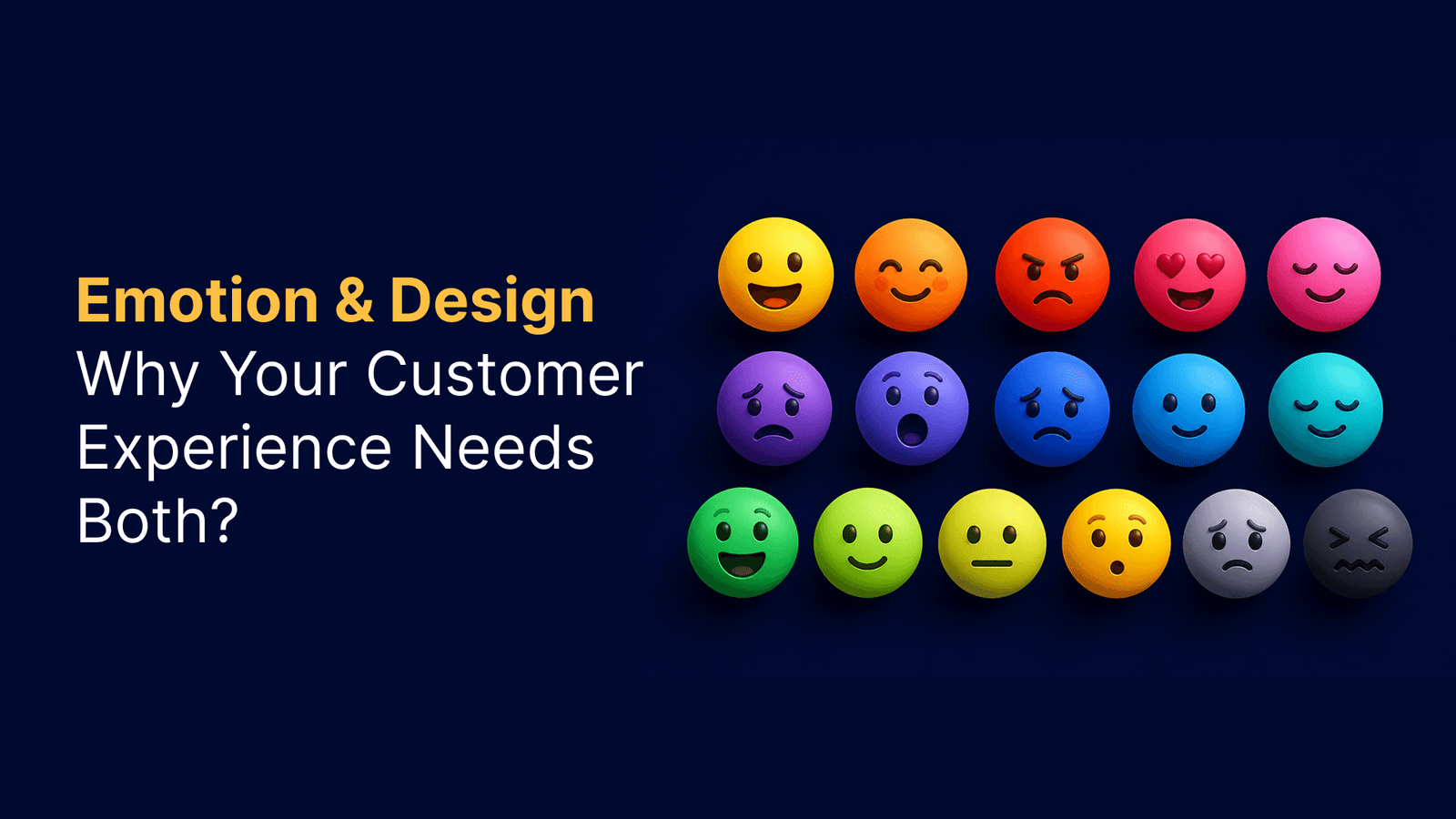
How colors affect user’s emotions
Colors spark emotional responses that shape our perceptions and behaviors beyond what we see. Studies show that between 62% and 90% of our quick decisions about products depend on color alone. Each color brings its own psychological effects:
- Red: Gets people excited, creates urgency, and stirs passion – many CTAs use it because it makes hearts beat faster
- Blue: Makes people feel safe, calm, and secure – banks and businesses choose it often
- Green: Shows growth, health, and balance – wellness and eco-friendly apps love it
- Yellow: Brings optimism, joy, and energy – it grabs attention but you shouldn’t use too much of either
- Purple: Links to creativity, luxury, and sophistication – brands don’t pick it as much
Colors do more than just stir emotions. They change how users act and convert. Research proves that a website’s color scheme changes how trustworthy users find it.
Cultural differences in color perception
Your cultural background shapes what colors mean to you. White means purity in Western cultures, but Eastern societies link it to death and mourning. Green connects to nature and growth in the West, yet Chinese culture might see it as a sign of cheating.
Red warns of danger in Middle Eastern nations but brings luck and happiness in China. These cultural differences matter when you design for people worldwide.
Industry-specific color associations
Each industry tends to pick certain colors that match its values. Banks and tech companies mostly pick blue to show they’re reliable and stable. Health and wellness brands go for blues and greens to promote better health.
Food and drink apps usually choose red and orange shades. Yet research suggests red might make people eat less, not more. Learning platforms, especially those for kids, use bright colors to help students learn and participate better.
These industry patterns help you pick colors that users expect while your brand stays unique.
Creating Your App’s Color Palette
A brand’s core values shape its color palette. The best approach starts with one dominant color that becomes your palette’s foundation.
Choosing a primary brand color
Your primary color makes up about 60% of your app’s visual space and acts as the life-blood of your brand identity. This color should match your app’s purpose and stir specific emotions in users. Blue works well for finance apps by building trust and professionalism. Wellness platforms often use green that represents growth. Your brand guidelines, if they exist, should guide your color choice since they express your brand values visually.
Selecting complementary and accent colors
After picking your primary color, you need one or more secondary colors that will take up roughly 30% of your interface. These colors should work with your primary choice without stealing the spotlight. Your balanced palette could include:
- Analogous colors (adjacent on the color wheel) that create harmony
- Complementary colors (opposite on the wheel) that pop with contrast
- Monochromatic variations that flow together seamlessly
Your accent color—used without much of either at about 10%—needs enough contrast to make call-to-action elements pop. This color helps buttons and key interactive elements grab attention.
The 60-30-10 rule for color distribution
The 60-30-10 rule helps balance your color choices. Your colors should split like this:
- 60% primary color on backgrounds and main surfaces
- 30% secondary color for supporting elements and typography
- 10% accent color on CTAs, highlights, and interactive elements
This distribution creates visual harmony while giving important elements the right amount of emphasis.
Tools for generating color combinations
These tools make palette creation a breeze:
- Adobe Color: Makes palettes from images and tests accessibility
- Coolors: Lets you create, save, and share color schemes quickly
- Canva’s Color Wheel: Shows complementary colors with clear explanations
- Material Design Color System: Builds harmonious, accessible palettes
These resources help solve the challenge of finding perfect app color combinations that look great and work well.
Applying Colors to UI Elements
Your color palette can change your app from basic functionality to a user-friendly experience. Colors you pick will shape how people use your interface.
Button and CTA color selection
CTAs and buttons need extra attention since they boost user participation. Studies show that bold, high-contrast colors catch the eye and work best for key buttons. Here’s what you should know about button colors:
- Your accent color works best for primary actions to stand out
- Bright warm colors like red signal warnings or errors
- Keep button colors consistent for each type throughout your app
HubSpot ran an A/B test that showed a red button performed 21% better than green. This happened because red created a sharp contrast against the green-heavy page. So the best button color isn’t fixed—it depends on what stands out most in your design.
Background and text color relationships
Text and background color combinations affect how easy content is to read. WCAG guidelines state that text contrast ratios need to be at least 4.5:1 for normal text and 3:1 for large text. A colored layer between text and images helps keep text readable.
Using color to establish visual hierarchy
Visual hierarchy directs users to important elements. Colors make certain elements pop out through salience. Here’s how to create good hierarchy:
- Give important items saturated colors and use muted shades for secondary elements
- Mix size, contrast, placement, and whitespace with color to control what stands out
- Keep your palette simple—2 primary and 2 secondary colors are enough
Color consistency across screens
Consistent colors build trust and make apps easier to use on any device. Adobe Creative Cloud keeps colors similar across all its applications. For mobile apps, you should:
- Set clear color rules throughout your interface
- Use the same colors for matching states (success, error, information)
- Check how your colors look on different screens and lighting
Color consistency goes beyond looks—it creates a reliable, natural experience that guides users through your app.
Ensuring Accessibility and Usability
Most designers push accessibility to the background during their design process. Yet approximately 8% of men and 0.5% of women experience some form of color blindness. A truly inclusive app needs to work for everyone, whatever their visual capabilities.
Color contrast requirements
The Web Content Accessibility Guidelines (WCAG) will give your app the usability that all audiences need. Here are the minimum contrast ratio requirements:
- 4.5:1 for normal text (smaller than 18pt or 14pt bold)
- 3:1 for large text (at least 18pt or 14pt bold)
- 3:1 for UI components and graphical objects needed to understand content
Text with poor contrast creates problems for most users. It becomes almost impossible to read for people with visual impairments. This directly affects your conversion rates – if 8% of male visitors can’t read your “Buy Now” button text, you’re losing potential customers.
Designing for color blindness
Red/green color blindness affects the largest percentage of users. Note that color-blind people don’t see the world without colors – they just have trouble telling certain color combinations apart. Your app’s color palette should:
- Never rely just on color to communicate information
- Use extra identifiers like icons, patterns, or labels
- Stay away from tricky combinations like red/green/brown, pink/turquoise/gray, and purple/blue
- Stick to blue/orange or blue/red combinations for the best results
Tools like Color Oracle, Coblis, and Stark help you see how your interface looks to color-blind users. Testing in grayscale also helps spot elements that become hard to distinguish without color.
Dark mode color considerations
Dark mode helps reduce eye strain and saves battery life on OLED screens. All the same, you need to plan it carefully:
- Use dark grays instead of pure black for background surfaces
- Pick slightly darker whites to reduce eye strain
- Make colors about 20 points less saturated compared to light mode
- Keep text contrast ratio at least 15.8:1 against dark backgrounds
Saturated colors can create visual vibrations against dark backgrounds. This causes eye strain and fails accessibility standards. The best approach is to let users pick between light and dark themes based on what works best for their eyes.
Conclusion
Color selection is a vital decision that shapes user experience, brand perception, and overall success. Your app’s colors connect with user emotions, guide interactions, and build trust. These color choices remain essential for any digital product.
A balanced approach makes color implementation work better. Your first step should be psychology-backed color choices. The 60-30-10 rule creates visual harmony, while your palette needs to work in different cultures and contexts. Accessibility should be your priority with proper contrast ratios and colorblind-friendly design choices.
Your color choices need testing well. Color tools help verify your selections and check accessibility compliance. User feedback completes the picture. A careful plan that considers these elements will help you create an app interface. Your users will find it appealing and get an inclusive, engaging experience.
FAQs
Q1. How do I select the right color scheme for my app?
Start by defining your app’s purpose and the emotions you want to evoke. Choose a primary color that aligns with your brand identity, then select complementary and accent colors. Use the 60-30-10 rule for color distribution, where 60% is your primary color, 30% secondary, and 10% accent. Consider cultural differences and industry-specific associations when making your choices.
Q2. What is the importance of color contrast in app design?
Color contrast is crucial for readability and accessibility. Aim for a minimum contrast ratio of 4.5:1 for normal text and 3:1 for large text and UI components. Proper contrast ensures that all users, including those with visual impairments, can easily read and interact with your app. It also helps in establishing visual hierarchy and guiding users’ attention to important elements.
Q3. How can I ensure my app’s color scheme is accessible to colorblind users?
To make your app colorblind-friendly, avoid relying solely on color to convey information. Use additional identifiers like icons or labels. Steer clear of problematic color combinations such as red/green/brown. Utilize tools like Color Oracle or Stark to simulate how your interface appears to colorblind users. Testing your design in grayscale can also help identify potential issues.
Q4. What should I consider when implementing dark mode in my app?
When designing for dark mode, use dark grays instead of pure black for backgrounds to reduce eye strain. Choose slightly darker whites for text and desaturate colors by about 20 points compared to light mode. Ensure text maintains a high contrast ratio against dark backgrounds. Allow users to switch between light and dark themes to cater to individual preferences.
Q5. How do colors affect user emotions and behavior in apps?
Colors have a significant psychological impact on users. For example, red can stimulate excitement and urgency, often used for call-to-action buttons. Blue evokes trust and reliability, making it popular for financial apps. Green represents growth and health, suitable for wellness applications. Understanding these associations helps in creating an emotionally resonant user experience that aligns with your app’s goals.