Our digital products often make life more stressful instead of easier. When using websites and apps, have you ever felt that moment of doubt—wondering if you clicked the right button or if your payment went through? This uncertainty in ux design can create genuine user anxiety, affecting how people interact with digital experiences.
When users feel uncertain about what to do next or whether they can trust a system, their confidence drops significantly. In fact, every hesitation adds friction, making the experience feel slow, untrustworthy, or confusing. This problem goes deeper than just momentary frustration. Information anxiety emerges when people face too much data or poorly organized content, leading to stress and confusion.
What many designers don’t realize is that emotional friction often goes unnoticed on analytics dashboards, yet it can determine whether someone completes a task or abandons it halfway. When users feel calm, they’re not only happier but also more capable, more trusting, and more likely to return to your product.
In this article, we’ll explore how thoughtful ux design can reduce anxiety (Designing for Uncertainty) during periods of uncertainty, creating experiences that help users feel confident rather than confused.
The hidden cost of uncertainty in UX
Uncertainty in design doesn’t show up as a glaring red flag. Instead, it takes its toll quietly through bad reviews, lost users, and diminished revenue. The scary part? Most businesses never connect these problems back to their root cause: moments of doubt in the user experience.
How small moments of doubt affect user behavior?
Imagine shopping online and seeing a vague message saying “Additional fees may apply” at checkout. You hesitate, wondering what fees and how much. That single unclear phrase just cost the company a conversion. These small moments of uncertainty pile up surprisingly fast.
Frustration emerges when user expectations don’t align with system responses. This isn’t just annoying—it’s a psychological reaction leading directly to disengagement. Generally, uncertainty triggers several harmful behaviors:
➡️ Decision paralysis: When faced with too many options or conflicting information, users often choose to do nothing at all
➡️ Loss aversion: People fear losing something more than they’re motivated by potential gains—making them avoid actions with unclear consequences
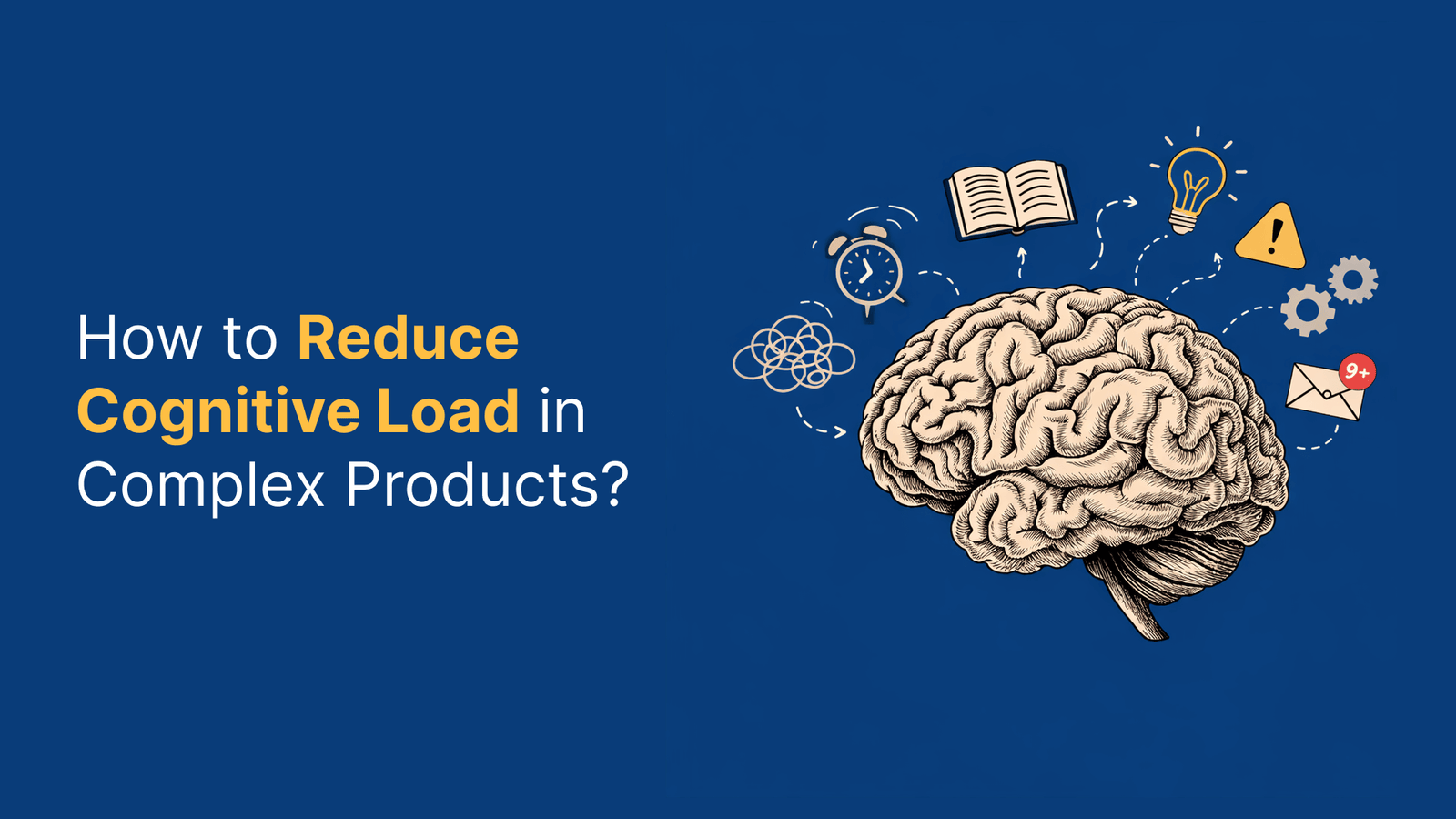
➡️ Increased cognitive load: The more mental effort required, the more users struggle to make confident decisions
Each moment of hesitation adds friction, making the experience feel slow, untrustworthy, or confusing. Furthermore, traditional metrics like bounce rate typically fail to capture these issues—uncertainty remains invisible in most analytics.
Why users abandon tasks without clear reasons?
The most dangerous type of user churn is silent. Most users don’t complain when they encounter a bad experience; they simply close the app and never return. Although many businesses focus on obvious technical issues, the subtle uncertainties often cause more damage.
According to research, users abandon tasks because:
➡️ Unclear next steps: Confusion is the ultimate friction. If users pause to figure out what to do next, you’ve already lost their momentum
➡️ Lack of trust signals: Without clear privacy information or polish, users feel unsafe
➡️ Unexpected friction: Slow-loading screens, intrusive pop-ups, or broken links break the user’s flow
In a meta-analysis of 471 different search instances, users only clicked through to the second page of search results in 2% of cases. Consequently, this shows how quickly users abandon when the path forward isn’t immediately clear.
The link between UX design and emotional stress
Poor UX design creates genuine emotional stress. Each unclear button, confusing form, or missing confirmation builds anxiety that affects how people interact with digital experiences. This emotional impact goes beyond mild annoyance.
Confusing workflows, high costs, and ambiguity directly contribute to abandonment. Moreover, cognitive overload from excessive information or visual clutter creates frustration that interrupts the user’s sense of control. Once control is lost, users rarely return.
The emotional toll manifests in several ways:
➡️ Frustration and disappointment: A poorly designed e-commerce website with confusing navigation, slow loading times, and unclear product descriptions leads to a disappointing experience and abandoned carts
➡️ Loss of confidence: Micro-interactions like unclear error messages, delayed feedback on clicks, or inconsistent behavior across screens erode user confidence
➡️ Breakdown of trust: User trust is fragile. A tiny lag at ‘transaction complete’ or unclear success confirmation can spark panic
Ultimately, the cost of uncertainty extends beyond lost conversions. It damages brand perception, increases support costs, and prevents the emotional connection that builds loyal customers. Addressing these hidden costs starts with recognizing that designing for certainty isn’t just about esthetics—it’s about reducing genuine human anxiety.
Understanding the psychology behind user hesitation
Behind every hesitant click lies a complex web of psychological factors that explain why users pause, second-guess themselves, or abandon tasks entirely. The human mind processes digital experiences through filters that evolved long before computers existed—making uncertainty particularly challenging to navigate.
Cognitive load and decision fatigue
Our brains have a finite amount of processing power, similar to computers with limited RAM. Scientists define cognitive load as the mental effort required to operate a system—essentially the “brain power” needed to understand and use an interface.
Every task, click, and decision consumes this limited mental resource. Eventually, this leads to decision fatigue—a state where our ability to make good choices deteriorates after extended periods of decision-making.
This phenomenon manifests in user behavior in several ways:
➡️ Depleting mental resources: The prefrontal cortex—responsible for reasoning and judgment—gradually loses efficiency as users make more choices throughout their experience
➡️ Defaulting to easier options: Once mentally tired, users resort to the simplest path, not necessarily the best one
➡️ Avoiding decisions entirely: At the extreme end, users may abandon tasks rather than continue investing mental energy
Particularly, overloaded designs with excessive stimuli create frustration as users struggle to process information. Minimizing extraneous cognitive load—processing that doesn’t help users understand content—remains crucial for preventing anxiety.
Loss aversion and ambiguity aversion
Two powerful psychological biases significantly impact how users approach uncertainty in digital experiences:
First, loss aversion describes our tendency to feel the pain of losing something approximately twice as intensely as the pleasure of gaining something equivalent. This explains why users hesitate before committing to actions where the outcome seems unclear—the fear of potential loss outweighs possible benefits.
For instance, the same medical treatment described as having a “10% mortality rate” versus a “90% survival rate” triggers completely different responses, despite communicating identical information.
Secondly, ambiguity aversion refers to how we naturally avoid options with unknown probabilities. Users strongly prefer known risks over unknown ones, even when the known option might objectively be less favorable.
These biases combine to create powerful effects:
➡️ Heightened scrutiny: Users examine ambiguous information with increased suspicion
➡️ Default to familiarity: When uncertain, people revert to what they know, even if suboptimal
➡️ Perceived value reduction: Unclear options automatically seem less valuable regardless of actual merit
Understanding these patterns helps explain why seemingly minor ambiguities in design can trigger disproportionate anxiety and abandonment.
Fear of making irreversible mistakes
Every interface carries an unspoken promise: “You’re safe here.” Nevertheless, many users approach digital experiences with deep-seated hesitation—they don’t want to break something, lose progress, or appear foolish.
This caution stems from past negative experiences:
➡️ Forms that wiped input after minor errors
➡️ Payment screens that froze without confirmation
➡️ Pop-ups that punished curiosity with irreversible consequences
Over time, these experiences condition users to tread carefully, hesitate to explore, and restrict their interactions. The fundamental truth remains that humans inevitably make mistakes—no system can be completely error-proof.
Hence, good design doesn’t attempt to eliminate all possibility of error. Instead, it reframes what mistakes mean by:
- Making actions reversible where possible
- Providing clear safety nets and undo options
- Acknowledging that errors will occur and minimizing their impact
To put it differently, when users believe an error won’t cost them much, they relax. That psychological safety creates the conditions for actual learning and engagement.
By understanding these psychological factors, designers can address the root causes of user hesitation, subsequently creating experiences that feel safe, predictable, and worthy of trust.
Common UX design mistakes that increase anxiety
Digital stress accumulates quietly through seemingly small design decisions that create major emotional impact. Unlike obvious technical bugs, these emotional landmines build pressure whenever a user hesitates, becomes unsure of what happens next, or needs to reread content to understand it. Let’s examine the most common design mistakes that trigger anxiety.
Vague CTAs and unclear next steps
Generic button labels like “Submit” or “Continue” leave users wondering what happens after they click. This uncertainty creates a moment of hesitation that can derail the entire user journey. Primarily, this affects two groups of users:
➡️ Regular users who lose momentum when forced to decipher vague instructions
➡️ Users with disabilities who rely on screenreaders and can’t determine which “Learn More” button connects to their desired content
The problem extends beyond buttons. Without clear next steps, visitors must find conversion content on their own—and they might give up and seek a competitor instead. In addition, vague navigation systems force users to spend excessive mental energy just figuring out where to go, creating frustration that could have been avoided with descriptive labels.
Lack of feedback and confirmation
One of the most anxiety-inducing design mistakes is insufficient feedback. When users don’t get immediate confirmation after completing an action, they question whether it worked correctly. This uncertainty is especially problematic during critical moments like:
➡️ Online payments and checkout processes
➡️ Form submissions
➡️ Account changes
A spinning wheel that lingers without any status update creates tension and makes users wonder: “Is it working? Should I refresh?”. Meanwhile, these seemingly minor doubts can have major consequences. Users might abandon checkout entirely or—even worse—try again, potentially creating duplicate orders by mistake.
First rule of good design: feedback should be immediate, subtle, and easily understandable so users can flow smoothly through processes.
Inconsistent layouts and navigation
Inconsistency in UX design manifests in various ways, each potentially devastating to the user experience. When every page follows different rules, users must constantly relearn how to interact with the interface, creating an unnecessarily steep learning curve.
This problem often stems from three main sources:
➡️ Lack of clear design guidelines
➡️ Poor collaboration between teams
➡️ Production pressures that lead to quick fixes
Beyond merely confusing users, inconsistency directly affects how people perceive your brand. A disjointed experience leaves an impression of negligence or incompetence in today’s competitive landscape. Equally important, these issues increase support costs as users with navigation problems are more likely to contact customer service.
Overwhelming users with too many choices
Offering too many options leads to what psychologists call choice overload—a state where users become so overwhelmed they hesitate, delay, or abandon decisions entirely. This paradoxical phenomenon contradicts the intuitive belief that more choices make users happier.
Choice overload damages the user experience through several mechanisms:
➡️ Analysis paralysis where excessive options prevent any decision
➡️ Decreased satisfaction with final selections
➡️ Association of stress with your brand
Too many competing calls-to-action on a single page confuse users about where to click, pulling attention away from important content. Furthermore, presenting too many concepts simultaneously makes it difficult for users to focus on just one piece of information—they’ll likely miss the key message entirely.
Overall, while you might think offering as many options as possible helps users find what they need, research shows the opposite: simplifying navigation menus, limiting filter sets, or progressively revealing options can significantly improve conversions and perceived usability.
Design principles that reduce stress and build trust
Creating certainty in user interfaces isn’t magic—it’s methodical. Fortunately, designers have specific principles that can transform anxiety-inducing experiences into calming ones, building a foundation of trust with every interaction.
Use of progressive disclosure
Progressive disclosure simplifies complex interfaces by revealing information only as needed. This approach reduces the cognitive load that often triggers anxiety in users. According to research, our brains have limited processing capacity—similar to computers with finite RAM.
Rather than overwhelming users with every possible option upfront, progressive disclosure presents only essential elements first, then reveals advanced features progressively as users need them. This technique offers several benefits:
➡️ Helps novice users focus on core features without feeling overwhelmed
➡️ Saves experienced users time by reducing scanning through rarely-used options
➡️ Improves learnability while reducing error rates
In practice, this might look like an e-commerce checkout that initially shows only basic fields, revealing shipping options or gift-wrapping only after initial information is complete. First, focus users’ attention on truly important elements, yet provide clear pathways to additional options when needed.
Providing undo options and safety nets
Nothing builds confidence faster than knowing mistakes aren’t permanent. Indeed, giving users the ability to reverse actions creates emotional safety that encourages exploration and engagement.
True undo functionality can be technically challenging to implement. However, creative alternatives exist:
➡️ Session-based “to-be-deleted” flags that only apply changes after confirmation
➡️ Edit windows that allow changes for a set period after submission
➡️ Clear cancel options at every step of critical processes
This approach works because it addresses a fundamental human need—we inevitably make mistakes. Good design acknowledges this reality without judgment, offering safety nets that let users recover gracefully.
Clear, friendly, and inclusive language
The words we use in interfaces directly impact how users feel while navigating them. Actually, unclear or technical language creates immediate barriers, whereas clear, approachable text builds trust.
Consider the difference between these error messages: “Error 409: Conflict” versus “Unable to complete this interaction because another interaction is already in progress.”
Primarily, inclusive language goes beyond mere clarity—it actively considers diverse users with different backgrounds, abilities, and experiences. This means:
➡️ Using plain, simple language free of idioms or jargon
➡️ Avoiding phrases that exclude certain groups
➡️ Explaining why information is being requested (specifically important for personal data)
Furthermore, descriptive button labels create certainty (“Save Changes” instead of “Submit”) and friendly confirmations acknowledge user actions without sounding robotic or technical.
Predictable and consistent interactions
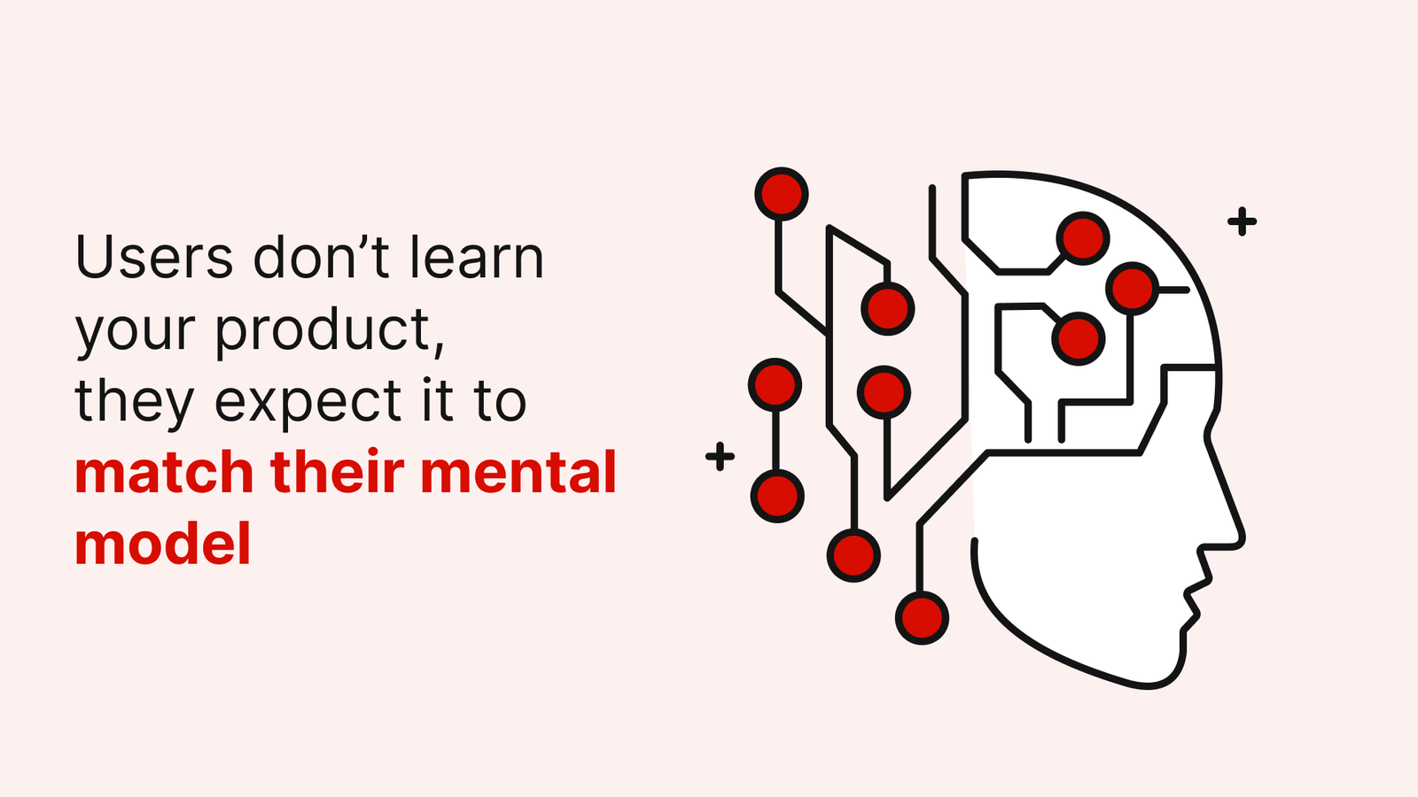
Predictability in design means that interfaces set accurate expectations about what will happen before users take action. This principle directly addresses uncertainty by making interactions feel safe and reliable.
According to Steve Krug’s principle, users should always be able to answer these questions: Where am I? How did I get here? What can I do here? Where can I go next?
Consistency strengthens predictability through:
➡️ Visual consistency in layouts, spacing, and navigation
➡️ Functional consistency in how similar actions work
➡️ External consistency with established design patterns
Nonetheless, consistency isn’t just about appearance—it’s about delivering on promises made by the interface. When a button looks clickable, it should be clickable. When an action looks destructive, there should be safeguards.
The comfort created by predictable interfaces isn’t just nice to have—it’s a “hard-wired cognitive requirement” that speeds task completion and builds confidence with every successful interaction.
Micro-interactions that create emotional safety
Small details make the biggest difference in how users feel. Micro-interactions—those subtle moments when users engage with an interface—form the emotional bridge between frustration and confidence. First and foremost, these tiny design elements provide users with crucial feedback that prevents doubt from creeping in.
Descriptive button labels
Vague button text creates instant uncertainty. Labels like “Submit” or “Continue” leave users wondering what happens next. In contrast, specific action verbs coupled with clear outcomes (“Save Changes” or “Send Message”) straightaway communicate exactly what will happen.
The most effective button labels:
➡️ Use action verbs that clearly describe the outcome
➡️ Keep text short (1-3 words) for better readability
➡️ Avoid technical jargon that creates barriers
Notably, labels clarify the purpose of icons, reducing ambiguity for all users, including those unfamiliar with common symbols.
Visual hierarchy and whitespace
Proper visual organization guides users naturally through interfaces without creating confusion. When everything competes for attention through bold fonts or clashing colors, users must work harder to interpret a screen.
Visual hierarchy employs several principles:
➡️ Alignment helps users understand related elements
➡️ Size differences signal importance of interface elements
➡️ Whitespace creates visual breathing room and reduces cognitive strain
Together with thoughtful grouping of related information, these techniques create interfaces that feel calmer and more navigable.
Status indicators and loading feedback
Nothing creates anxiety faster than uncertainty about whether a system is working. Loading indicators immediately communicate that the system is processing, preventing users from wondering “Is it working? Should I refresh?”
Even brief delays without feedback can spark doubt:
➡️ Progress bars with percentage completion provide concrete feedback
➡️ Spinners signal activity when exact time cannot be determined
➡️ Skeleton screens (placeholder content) set expectations while waiting
As a rule of thumb, immediate feedback should be provided for any wait longer than 2 seconds, with percentage indicators for waits exceeding 10 seconds.
Batch notifications and quiet modes
Constant interruptions fragment attention and create stress. Batch notifications consolidate updates, allowing users to process information on their schedule. This approach is particularly valuable for products where each notification requires careful consideration.
Quiet modes offer users control over when they receive information:
➡️ Consolidating alerts reduces cognitive interruption
➡️ Background processing of non-critical tasks maintains focus
➡️ User-controlled notification preferences build trust
By designing these thoughtful micro-safety nets, we acknowledge that small moments of certainty accumulate into an experience that feels trustworthy and calm.
Building a culture of calm UX design
Calm design thrives beyond individual techniques—it requires an organizational shift in priorities and values. Primarily, calm isn’t merely a visual style but a design ethic that emerges from deliberate choices prioritizing user well-being over novelty and clarity over cleverness.
Shifting from engagement to intention
Traditional success metrics like time-on-page or usage frequency often mislead teams—a user returning five times daily might be engaged or simply lost and anxious. These shallow metrics reveal activity without context.
A calm-design approach asks deeper questions:
➡️ Is this interaction truly necessary?
➡️ Does this feature respect the user’s time and mental state?
➡️ What can we intentionally leave out?
The true shift begins at the product planning stage where teams grounded in calm design understand that restraint isn’t omission—it’s care.
Cross-functional alignment on user well-being
Calm experiences require collaboration beyond the UX team alone. Product managers, engineers, and stakeholders must jointly recognize that fostering users’ peace of mind is a core value, not an afterthought. This unified vision enables “invisible wins”—moments where users feel calm not because something flashy happened but because nothing confusing occurred.
Measuring emotional friction in usability testing
Traditional usability testing focuses predominantly on task completion rates yet misses emotional impact. Additionally, teams should observe signs of tension such as long pauses, hesitant clicks, or back-and-forth navigation. These friction points reveal interfaces that may function technically but remain emotionally taxing.
First, look for non-verbal cues during testing. Next, create environments where participants comfortably share feelings, not just actions.
Designing for trust, not just attention
Ultimately, cultivating calm means trusting users. This requires confidence that you don’t need to nudge, ping or prod users into engagement. A tool designed with grace and clarity earns returns because it genuinely helps—not because it hijacks attention.
Trust emerges through transparent communication and clear intentions. As digital wellbeing becomes increasingly important, designers must create experiences that help users maintain balanced relationships with technology. This approach recognizes that users are human—tired, distracted, overwhelmed—and meets them with softness rather than sharpness.
Conclusion
Designing for uncertainty represents a fundamental shift in how we approach digital experiences. Uncertainty actually costs businesses real money through abandoned carts, lost users, and damaged brand perception. We must acknowledge that every unclear button label, confusing form, or missing confirmation creates genuine emotional stress for users.
Throughout this exploration, several key principles have emerged that can transform anxiety-inducing interfaces into calm, trustworthy experiences:
➡️ Clarity beats cleverness every time – users need straightforward paths without guesswork
➡️ Feedback should happen immediately so users never wonder if their action registered
➡️ Safety nets like undo options build confidence and encourage exploration
➡️ Simple language creates accessibility while technical jargon builds barriers
The psychology behind user hesitation runs deeper than most analytics can measure. Users avoid ambiguity, fear making mistakes, and quickly deplete mental resources when forced to process complex interfaces. Therefore, good design must address these human realities rather than fighting against them.
Micro-interactions matter significantly more than we typically acknowledge. Those tiny moments of feedback – a button changing color, a progress indicator appearing, or a friendly confirmation message – collectively determine whether users feel safe or stressed while using our products.
Similarly, shifting organizational focus from grabbing attention to respecting user intention creates fundamentally different products. This approach recognizes that users come to our digital spaces with goals, not merely time to spend.
Ultimately, designing for certainty isn’t just about preventing negative emotions – it enables positive ones. When users feel confident, they explore more freely, trust your brand more deeply, and return more frequently. Good UX design, consequently, acts as an invisible support system that helps people accomplish their goals without unnecessary friction or doubt.
The most successful digital products will undoubtedly be those that respect users enough to create experiences where clarity reigns and anxiety vanishes. After all, technology should make life easier, not add to its complications.
Key Takeaways
Understanding how uncertainty creates anxiety in digital experiences is crucial for building products that users trust and return to. Here are the essential insights for creating calmer, more confident user experiences:
• Uncertainty silently destroys conversions – Vague CTAs, unclear next steps, and missing feedback create hesitation that leads to task abandonment without obvious reasons in analytics.
• Cognitive load and decision fatigue compound user stress – Our brains have limited processing power, so overwhelming interfaces with too many choices or complex layouts exhaust users mentally.
• Micro-interactions build emotional safety – Descriptive button labels, immediate loading feedback, and clear status indicators prevent moments of doubt that accumulate into anxiety.
• Progressive disclosure reduces overwhelm – Revealing information only as needed helps users focus on essential tasks without feeling bombarded by unnecessary options.
• Safety nets encourage exploration – Providing undo options and reversible actions builds confidence, allowing users to engage more freely without fear of permanent mistakes.
• Shift from engagement metrics to user intention – Measuring time-on-page misses the point; calm design prioritizes helping users accomplish goals efficiently rather than maximizing attention.
When users feel certain about what will happen next, they relax. That psychological safety transforms digital experiences from sources of stress into tools that genuinely help people achieve their goals with confidence.
FAQs
Q1. How does uncertainty in UX design affect user behavior?
Uncertainty in UX design can lead to decision paralysis, increased cognitive load, and loss aversion. Users may abandon tasks, avoid making decisions, or choose familiar but suboptimal options when faced with unclear interfaces or vague instructions.
Q2. What are some common UX design mistakes that increase user anxiety?
Common mistakes include using vague call-to-action buttons, providing insufficient feedback on user actions, implementing inconsistent layouts and navigation, and overwhelming users with too many choices. These issues can create hesitation and frustration, leading to a poor user experience.
Q3. How can progressive disclosure improve user experience?
Progressive disclosure simplifies complex interfaces by revealing information only as needed. This approach reduces cognitive load, helps novice users focus on core features, and improves learnability while reducing error rates. It presents essential elements first and reveals advanced features progressively as users require them.
Q4. Why are micro-interactions important in creating emotional safety for users?
Micro-interactions, such as descriptive button labels, visual hierarchy, and loading feedback, provide crucial cues that prevent doubt and anxiety. These small design elements offer immediate feedback, guide users through interfaces, and create a sense of confidence and control during the user experience.
Q5. How can organizations shift towards a culture of calm UX design?
To build a culture of calm UX design, organizations should prioritize user well-being over engagement metrics, align cross-functional teams on the importance of user-centric design, measure emotional friction in usability testing, and focus on designing for trust rather than just attention. This approach creates experiences that respect users’ time and mental state while helping them achieve their goals efficiently.