UX accessibility affects the lives of 61 million adults in the United States who live with a disability. As we move into 2025, creating inclusive digital experiences is no longer optional—it’s essential for reaching all potential users of your products.
When designing accessible interfaces, we must consider diverse user needs, including those who navigate websites using only keyboards due to motor impairments. In fact, accessibility in UX design has seen significant progress over the years, with the number of senior internet users alone growing from 4.2 million in 2002 to 19 million by 2012. However, meeting standards like maintaining proper color contrast ratios of at least 4.5:1 between text and background remains a challenge for many teams.
In this comprehensive guide, we’ll explore the foundations of UX accessibility, provide a practical checklist for 2025, and share best practices for designing interactive elements that work for everyone. Whether you’re new to accessibility or looking to refine your approach, this guide will help you create more inclusive digital experiences.
Foundations of UX Accessibility
“Accessible design is good design”
Creating digital experiences that work for everyone begins with understanding the fundamental principles that make interfaces truly accessible. Beyond simply adhering to guidelines, accessibility requires a thoughtful approach to design that considers the diverse needs of all users.
What is accessibility in UX?
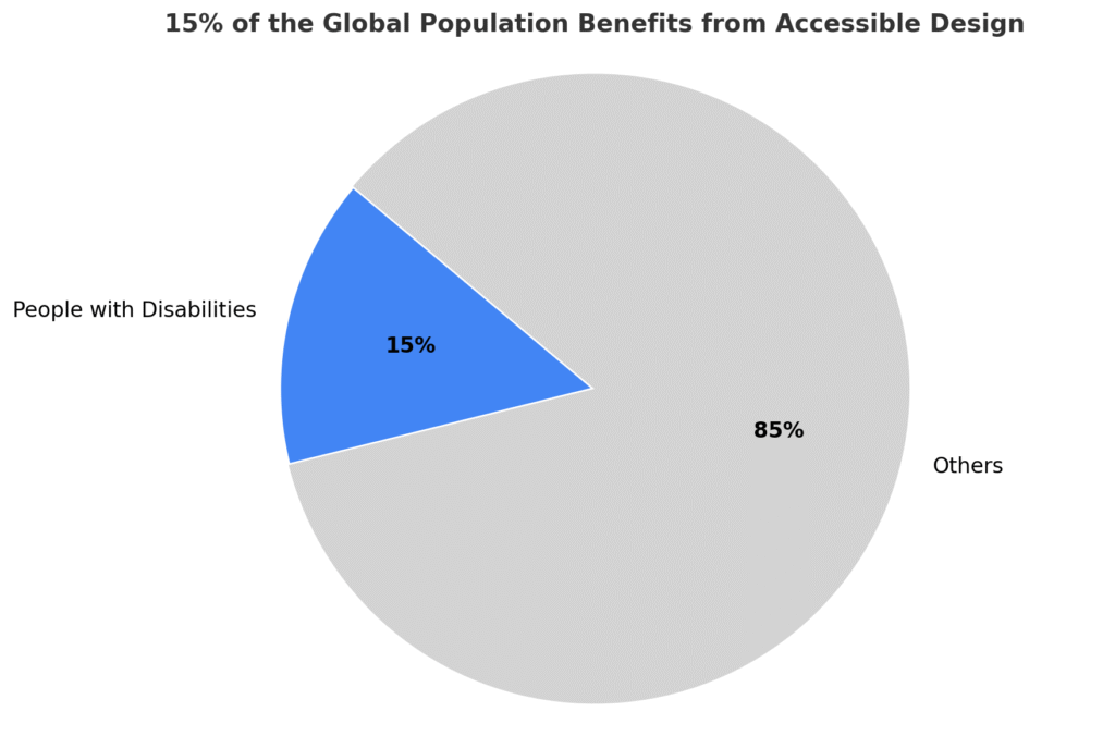
Accessibility in UX design refers to the practice of creating digital products and services that can be used by people with various abilities and disabilities. According to the World Health Organization, approximately 15% of the world’s population lives with some form of disability. This means that without accessible design, you’re potentially excluding one in seven people from using your product.
The Web Content Accessibility Guidelines (WCAG) define four essential principles that form the foundation of accessible design:
- Perceivable: Users must be able to perceive content through one or more senses, requiring alternatives for non-text content through captions, transcripts, and alt text
- Operable: Interfaces must be navigable through different input methods like keyboard, mouse, touch, or voice
- Understandable: Content should be clear, consistent, and presented in plain language that’s easy to comprehend
- Robust: Products must be compatible with current and future technologies, particularly assistive devices
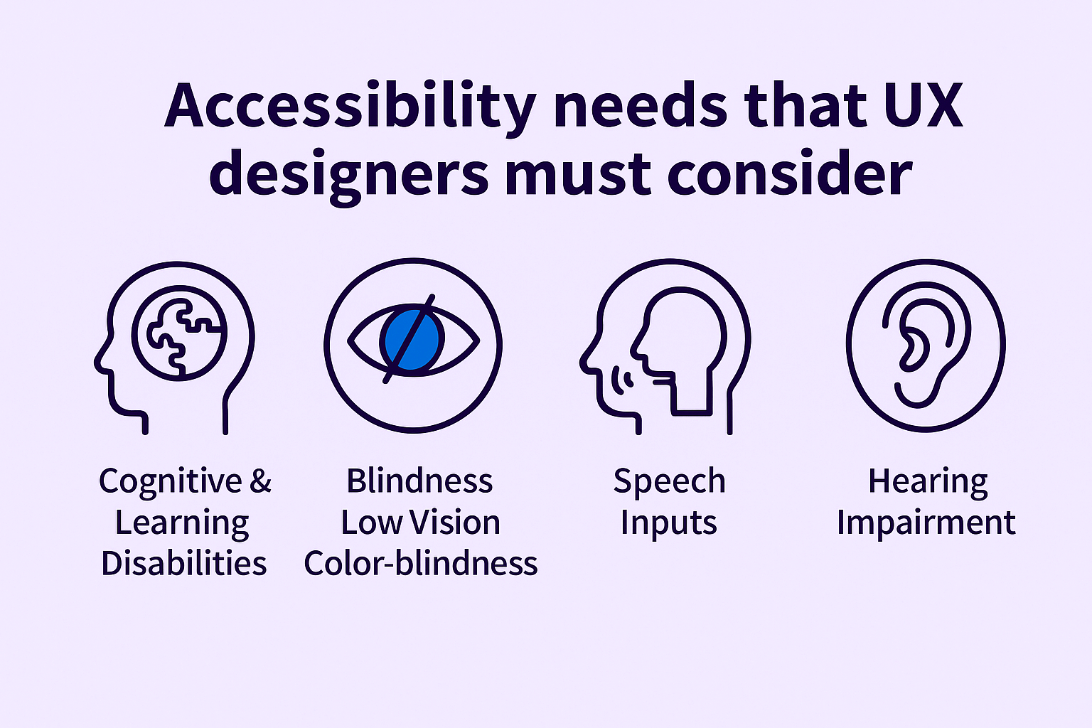
Essentially, accessibility ensures that digital interfaces can be accessed, navigated, understood, and interacted with by users of all abilities. This includes considerations for people with visual, hearing, motor, and cognitive impairments.
The role of UX designers in inclusive design
Designers play a critical role in championing inclusivity through thoughtful interface creation. Rather than treating accessibility as an afterthought, effective UX designers integrate inclusive principles throughout the entire design process.
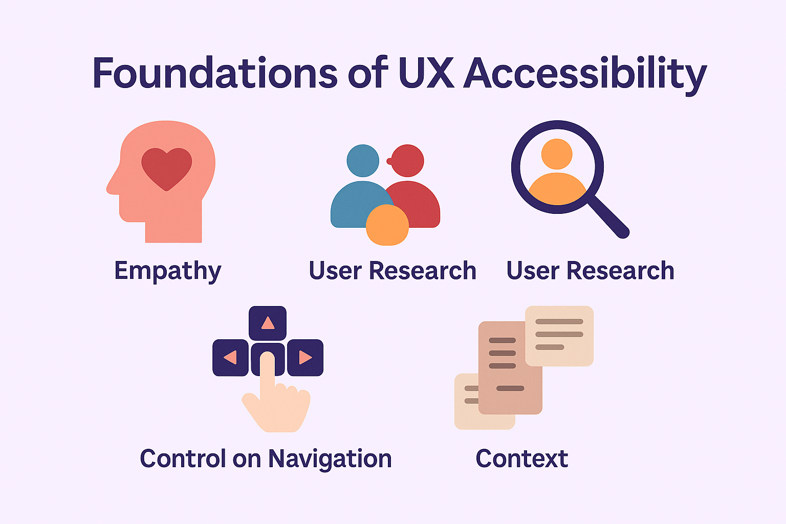
This begins with empathy—putting themselves in users’ shoes to understand their needs, challenges, and preferences. Furthermore, designers must analyze user behaviors and anticipate various requirements to build interfaces that accommodate diversity without compromising functionality.
Some key strategies designers implement include:
- Color schemes with high contrast options for users with visual impairments
- Screen reader compatibility for blind or low-vision users
- Voice navigation interfaces to benefit those with motor impairments
- Subtitles and captions for users with hearing difficulties
- Customizable controls to help users with varied motor abilities
Most importantly, designers should involve diverse user groups with different abilities in research and testing. As Alison Shaw, Director of Design Systems at Zendesk, notes: “Inclusivity means making your software the most usable by the widest range of people, including—but not limited to—people with disabilities”.
Accessibility vs usability
Although closely related, accessibility and usability serve different purposes in UX design. Usability focuses on creating effective, responsive, and interactive experiences that satisfy users generally. In contrast, accessibility ensures equitable experiences for all users, regardless of their physical or cognitive abilities.
The ISO 9241-11 standard defines usability as the “extent to which a product can be used by specified users to achieve specified goals effectively, efficiently and with satisfaction in a specified context of use”. Meanwhile, accessibility specifically addresses the needs of people with disabilities, ensuring they can access equivalent user experiences.
Consider this comparison:
| Aspect | Usability | Accessibility |
|---|---|---|
| Focus | All users’ satisfaction | Equal access for disabled users |
| Goal | Effectiveness and efficiency | Equity and inclusion |
| Scope | General user experience | Specific accommodations |
| Testing | Typical user flows | Specialized scenarios |
Nonetheless, there’s significant overlap between these concepts. Many accessibility features benefit everyone—video captions that help deaf users also benefit those watching content in noisy environments. Similarly, legible, high-contrast text helps both users with vision difficulties and those using mobile devices outdoors in bright sunlight.
Accessibility testing can be viewed as a subset of usability testing where the test subjects have disabilities affecting how they use digital products. For optimal results, designers should address both accessibility and usability together during product development.
UX Accessibility Checklist for 2025
As digital platforms increasingly become our primary means of interaction, the implementation of accessibility standards ensures everyone can navigate and enjoy digital experiences. This UX accessibility checklist for 2025 outlines key implementation steps that address the most common barriers faced by users with disabilities.
Text alternatives for non-text content
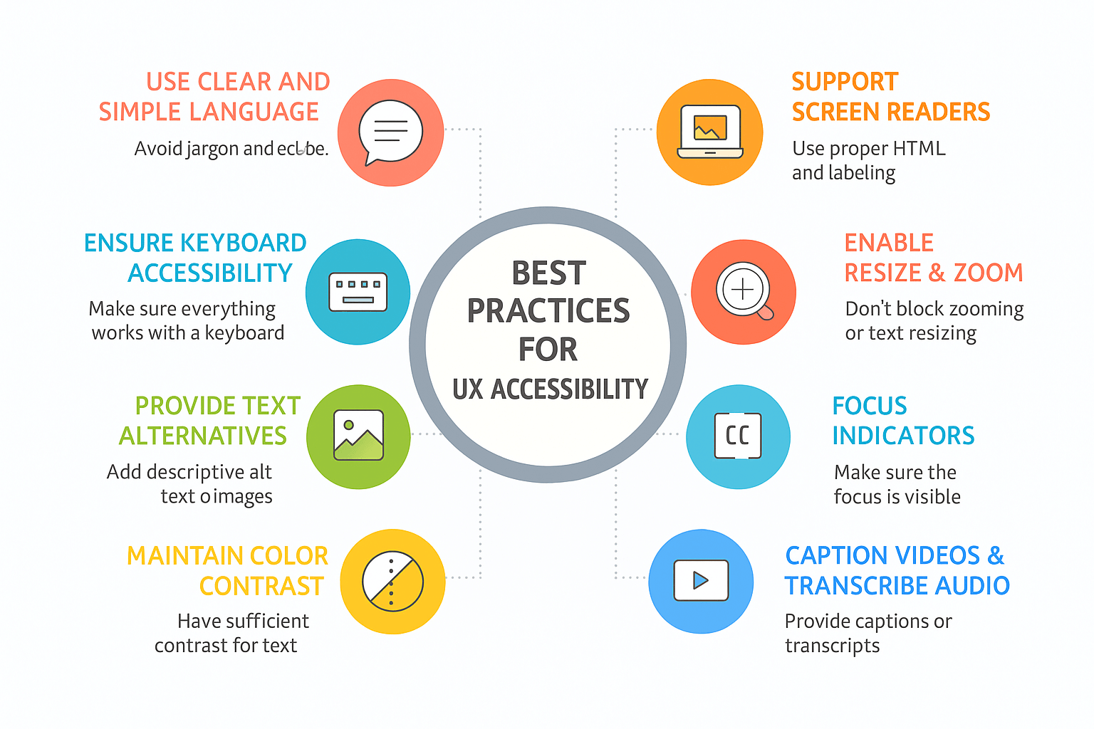
Non-text content accessibility forms the cornerstone of inclusive design, covered in WCAG’s very first guideline. Consequently, providing clear text alternatives enables users with visual impairments to access your content through screen readers or braille displays.
For effective text alternatives:
- Ensure every informative image has descriptive alt text that conveys its purpose and function
- Provide transcripts for audio content and captions for video media
- Include text alternatives for charts, graphs, and data visualizations
- Add descriptive names for functional elements like buttons and controls
Remember that accuracy matters—alternative text should provide equivalent information without unnecessary details. For purely decorative images that don’t add meaning, use the null alt attribute (alt="") so screen readers will skip them.
Keyboard navigation and focus order
Many users rely exclusively on keyboards for navigation, either by preference or necessity. Above all, ensure all interactive elements are accessible without a mouse.
Keyboard accessibility requires:
- A logical, intuitive focus order that follows the visual layout of your page
- Visible focus indicators with high contrast (at least 3:1 ratio)
- No keyboard traps where users get stuck in an element
- Skip navigation links to bypass repetitive content
Focus indicators should never be removed with CSS (outline: none or outline: 0), as this makes keyboard navigation virtually impossible. Subsequently, consider enhancing default browser focus styles to match your design while maintaining visibility.
Color contrast and visual clarity
Proper contrast between text and backgrounds significantly impacts readability for all users, especially those with low vision. According to WCAG standards, maintain a contrast ratio of at least 4.5:1 for normal text and 3:1 for large text (18pt or 14pt bold).
Furthermore, never rely solely on color to convey information. Use additional indicators like text labels, patterns, or icons to ensure users with color blindness can understand your content.
Responsive and reflowable layouts
As of 2025, responsive design is no longer optional. Your content must reflow properly when users zoom in or access it on different devices. WCAG Success Criterion 1.4.10 requires that content can be presented without requiring horizontal scrolling at widths equivalent to 320 CSS pixels.
This means users should be able to zoom content up to 400% without needing to scroll horizontally to read text. Moreover, fluid layouts that dynamically adjust based on screen size make websites more accessible to users with disabilities by ensuring content remains readable on any device.
Accessible forms and inputs
Forms often create significant barriers for users with disabilities if not properly designed. To ensure accessibility:
- Provide explicit labels for all form controls using the
<label>element - Group related controls with
<fieldset>and<legend>elements - Include clear instructions and error messages
- Ensure forms are keyboard accessible
- Use appropriate autocomplete attributes for common fields
For error handling, apply the aria-invalid="true" attribute to fields that fail validation, which causes screen readers to announce “invalid” when users focus on those fields.
Avoiding flashing content
Content that flashes or blinks can trigger seizures in people with photosensitive epilepsy. Additionally, such content can distract users with attention deficit disorders.
To protect users:
- Avoid content that flashes more than three times per second
- If animation is necessary, make it smaller than 10% of the screen
- Provide play/pause controls for moving content
- Stop auto-scrolling content when it receives focus
- For carousels, add navigation options and stop auto-rotation on interaction
By implementing these six critical accessibility checkpoints, you’ll create more inclusive digital experiences while addressing WCAG compliance requirements. Remember that accessibility benefits everyone—from users with permanent disabilities to those with temporary limitations or situational challenges.
Designing Interactive Elements for All Users
Interactive elements form the backbone of user interaction with digital products. Designing these elements with accessibility in mind creates better experiences not only for users with disabilities but for everyone navigating your interface.
Touch target sizing and spacing
Interactive elements must be large enough for users with motor impairments to tap accurately. According to WCAG 2.5.8 criteria, touch targets should measure at least 24×24 CSS pixels to ensure reliable interaction. Nevertheless, many accessibility experts recommend even larger targets:
- For optimal usability, aim for touch targets of 44×44 pixels minimum
- On Android, Google recommends touch targets of 48×48dp (approximately 9mm)
- Ensure clickable areas extend beyond visual elements when design constraints limit button size
Even though you might have small visual elements, the actual tappable area should be larger. This approach significantly helps users with hand tremors, those using specialized input devices, or anyone operating devices in unstable environments like public transportation.
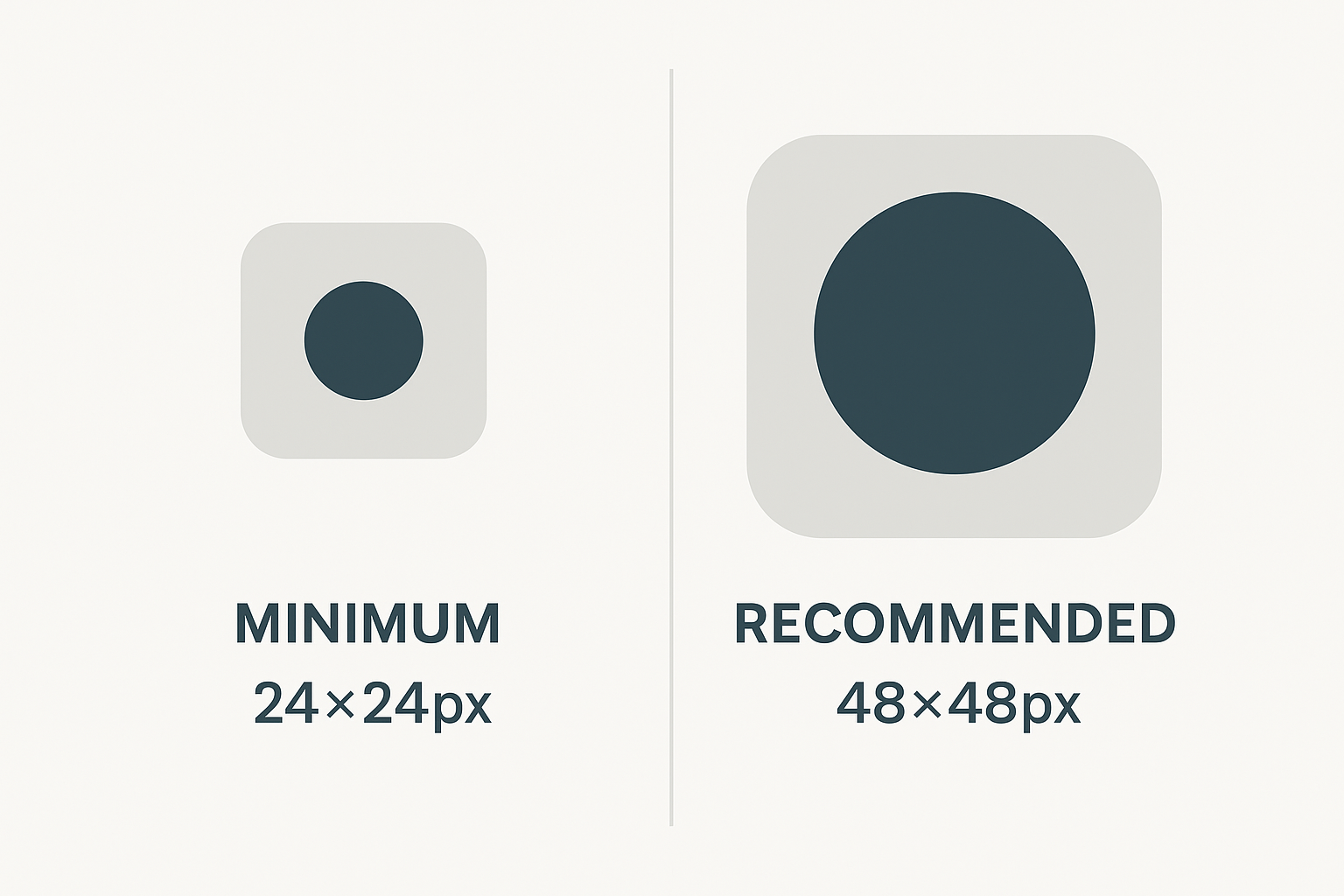
Beyond size, spacing between interactive elements proves equally crucial. When targets cannot meet minimum size requirements, they must have sufficient space around them. Ideally, undersized elements should be positioned so that a 24 CSS pixel diameter circle centered on each target doesn’t overlap with adjacent targets.
Accessible dropdowns and modals
Dropdowns and modals create particular challenges for accessibility despite their widespread use. For accessible dropdowns:
First thing to remember is that dropdowns should be fully navigable via keyboard. Many users rely exclusively on keyboard navigation, making tab order and focus management essential for these elements.
Besides maintaining keyboard accessibility, dropdowns should have clear visual indicators and consistent styling to help users recognize interactive elements. Since dropdowns hide options by default, they create additional cognitive load—consider alternative interfaces like radio buttons when space permits.
For modal windows, focus management becomes critical. When a modal opens, focus should automatically move to the first interactive element within it. Once the modal closes, return focus to the triggering element. Additionally, modals should “trap” keyboard focus while open, preventing users from tabbing to elements behind the modal.
On mobile devices, modals require special consideration:
- Implement full-screen approaches when necessary
- Provide larger tap targets within the modal
- Ensure users can easily close the modal without frustration
Avoiding device-dependent gestures
Many mobile interfaces rely on gestures like swiping or pinching that some users cannot perform. In other words, relying solely on these interactions creates barriers for accessibility.
Before implementing gesture-based interactions, consider these principles:
Don’t assume all users have the same physical capabilities. Some users may have fewer than five fingers, wear glasses, have arthritis, or use assistive technologies. Certainly, this means providing alternative interaction methods alongside gestures.
Keep gestures close to the body and flowing naturally with joint movement. Single-handed gestures typically work better than two-handed ones, being simpler and easier to execute repeatedly.
For any gesture-based feature, provide clear visual cues (signifiers) that indicate possible interactions. Many gestures suffer from poor discoverability—users simply don’t know they exist unless explicitly shown.
Developing truly inclusive interactive elements requires thoughtful consideration of diverse user needs throughout the design process.
Content Structure and Navigation Clarity
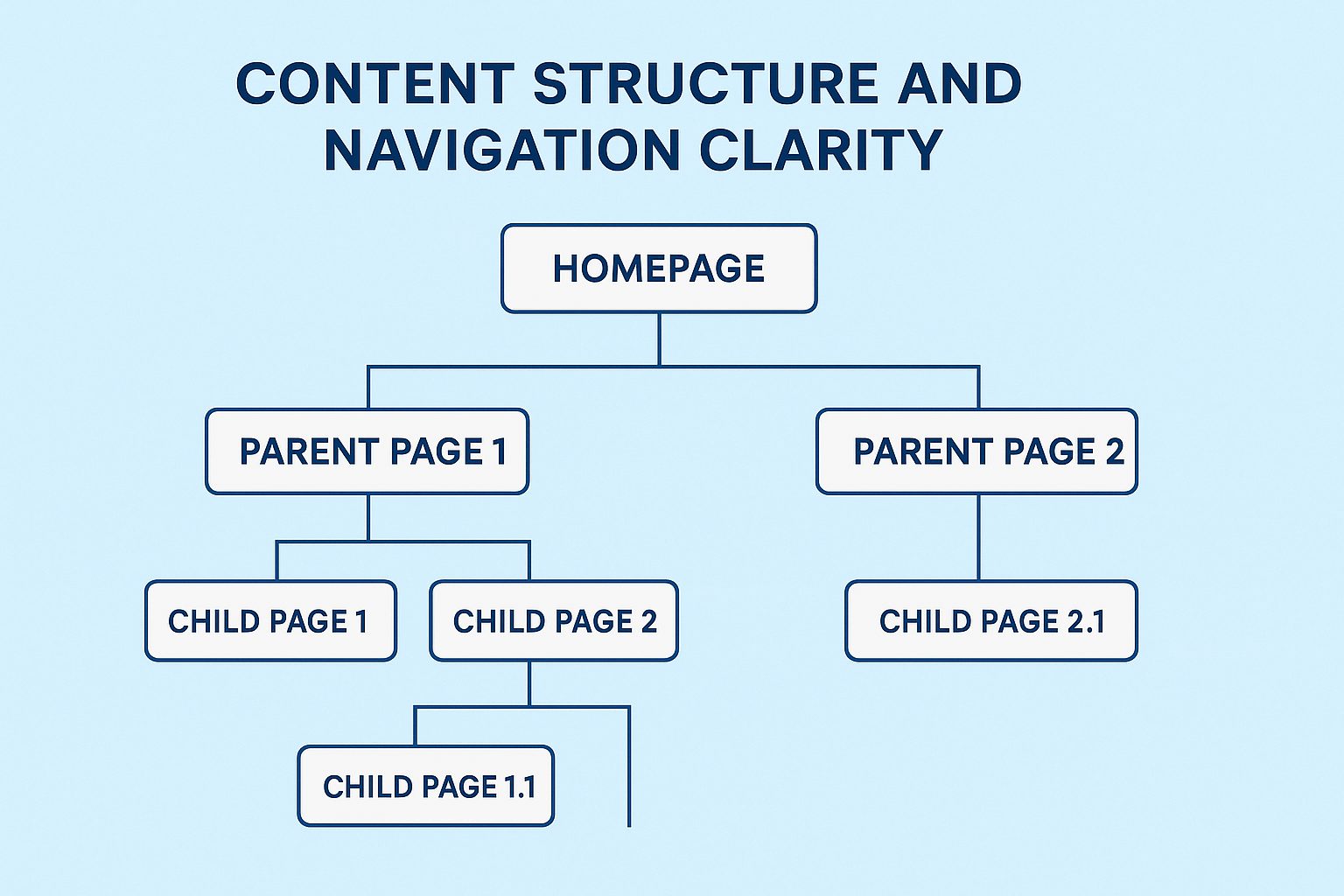
Well-structured content and clear navigation are the backbone of accessible digital experiences. When users can easily understand how information is organized and move seamlessly through your interface, you create an environment where everyone can succeed, regardless of their abilities.
Consistent navigation and layout
Users build mental models of how websites function based on their experiences. Therefore, maintaining consistency across your site helps everyone navigate with confidence. Keep your navigation menus, search functionality, and page layouts consistent across all pages and screen sizes to reduce cognitive load.
Semantic HTML markup is vital for creating accessible navigation structures. According to accessibility standards, proper implementation includes:
- Using the HTML5
<nav>element to identify menus - Implementing unordered lists (
<ul>) for most navigation menus - Applying clear labels to help users distinguish between multiple menus on a page
For screen reader users, properly structured navigation allows them to understand how many items are in a menu and provides corresponding navigation functionality. Furthermore, using aria-current="page" to indicate the current page in the menu significantly improves orientation.
Descriptive link text and headings
Link text should clearly communicate where the link leads without relying on surrounding context. Notably, screen reader users often navigate by tabbing through links or bringing up a links list, which removes the context of surrounding text.
Avoid generic phrases like “click here” or “read more” that provide no information about the destination. Instead, use descriptive phrases that make sense even when read in isolation. For instance, “Learn more about UX accessibility guidelines” is much clearer than simply “Learn more.”
Headings provide the structural framework of your content and are among the most important navigation tools for screen reader users. In fact, a WebAIM survey found that most screen reader users prefer headings as their primary method for finding information within a page. Create a logical hierarchy starting with a single H1, followed by H2s for major sections, and H3s for subsections.
Multiple ways to find content
Offering various navigation paths accommodates different user preferences and abilities. Users with low vision might find using search functionality easier than navigating through visual menus, whereas others with cognitive impairments might prefer a site map or table of contents.
Effective navigation alternatives include:
- Search functionality – Place search boxes in prominent, consistent locations
- Breadcrumb trails – Help users understand their location within complex sites
- Skip navigation links – Allow keyboard users to bypass repetitive elements
- Site maps – Provide a complete overview of site structure
- Tables of content – Offer quick access to sections within long content
Skip navigation links deserve special attention as they dramatically improve the experience for keyboard users. Without them, users must tab through repetitive navigational elements on every page visit. These links should be the first focusable element on each page, typically visible when focused via keyboard.
Ultimately, clear content structure and intuitive navigation benefit everyone—not just users with disabilities. As a result, investing in these foundational elements creates better experiences across your entire user base.
Testing Accessibility in UX Design

Testing verifies whether your UX design truly works for everyone, not just in theory. Without thorough testing, accessibility barriers often remain hidden until users encounter them in the real world.
Manual testing with screen readers
Screen readers convert on-screen text into speech or braille, enabling users with visual impairments to access digital content. Predominantly, people with sight loss rely on these tools to navigate websites independently.
Popular screen readers include:
- NVDA: Free, open-source option for Windows
- VoiceOver: Built into macOS/iOS devices
- JAWS: Paid professional screen reader
When testing with screen readers, listen for proper announcement of:
- Headings and content structure
- Image descriptions via alt text
- Form fields and their labels
- Interactive elements like buttons and links
Keyboard-only navigation tests
Testing without a mouse reveals accessibility issues that automated tools might miss. To conduct keyboard testing, put your mouse aside and navigate using only Tab, Shift+Tab, Enter, and arrow keys.
Verify that:
- All interactive elements receive visible focus
- Tab order follows a logical sequence
- No “keyboard traps” prevent users from moving through the interface
- Skip navigation links allow bypassing repetitive elements
Using tools like Lighthouse and Ax
Automated testing tools quickly identify common accessibility issues, though they typically catch fewer than half of all accessibility problems.
Google Lighthouse provides accessibility audits directly in Chrome DevTools, generating detailed reports with specific suggestions for improvement. Similarly, Ax DevTools offers browser extensions that identify WCAG compliance issues.
Both tools have strengths:
- Lighthouse integrates with performance and SEO testing
- Ax focuses specifically on accessibility with fewer false positives
User testing with people with disabilities
Ultimately, nothing replaces testing with actual users who have disabilities. During these sessions, participants complete tasks while providing feedback about their experience.
When conducting accessibility user testing:
- Recruit participants with diverse disabilities
- Allow users to use their own devices and assistive technologies
- Prepare fewer tasks than in typical usability studies
- Avoid interrupting screen reader output
This direct feedback reveals nuanced accessibility issues that no automated tool can identify, providing invaluable insights for creating truly inclusive designs.
Building an Accessibility-First Design Culture
“The power of the Web is in its universality. Access by everyone regardless of disability is an essential aspect.” — Tim Berners-Lee, Inventor of the World Wide Web; Director of the World Wide Web Consortium (W3C)
Building a truly inclusive product starts with organizational culture. Accessibility must be woven into your design DNA rather than treated as an afterthought, which otherwise costs significantly more to fix later.
Creating accessible design systems
Fundamentally, accessible design systems serve as your foundation for consistent, inclusive experiences. Rather than retrofitting accessibility features, build them into your component library from the beginning.
Start by documenting accessibility requirements for each component:
- Keyboard navigation patterns and focus management
- Required ARIA attributes and roles
- Screen reader behavior expectations
- Color combinations meeting contrast requirements
According to Deque research, 67% of accessibility issues stem from design flaws rather than development problems. A well-structured design system helps prevent these issues before they reach production.
Cross-functional team collaboration
Initially, form a group of Accessibility Champions across disciplines. This approach redistributes expertise throughout your organization and makes accessibility everyone’s responsibility. Include designers, developers, QA specialists, and content creators.
Creating shared understanding is vital. One effective strategy involves empathy workshops where team members switch roles for a day, improving collaborative efficiency by up to 30%. These exercises help developers understand design constraints while helping designers grasp technical limitations.
Documenting accessibility decisions
Correspondingly, thorough documentation transforms how teams approach accessibility. Each design handed from designers to engineers should include keyboard behaviors, semantic labels, and interaction patterns.
This documentation process does more than ensure implementation quality—it trains designers to consider accessibility earlier. Designers who define accessibility specifications are more likely to design with disability in mind from the project’s beginning.
For effective documentation, separate these two key aspects:
- Keyboard behavior and focus management
- Semantic labels for assistive technology
Together, these cultural shifts create environments where accessibility becomes standard practice rather than a separate consideration—benefiting all users through more thoughtful, inclusive designs.
Conclusion
Accessibility serves as the cornerstone of truly universal digital experiences. Throughout this guide, we’ve explored how thoughtful design choices can create interfaces that work for everyone, regardless of their abilities or limitations.
The path toward inclusive design begins with understanding the four pillars of WCAG guidelines—perceivable, operable, understandable, and robust interfaces. Additionally, our 2025 checklist provides actionable steps to implement these principles through proper text alternatives, keyboard navigation, color contrast, responsive layouts, accessible forms, and flash-free content.
Consequently, designing interactive elements with appropriate touch targets, accessible dropdowns, and device-independent interactions ensures users with motor impairments can navigate your products effortlessly. Clear content structure further supports this goal through consistent navigation, descriptive links, and multiple pathways to information.
Testing remains undeniably critical—both through automated tools like Lighthouse and Ax and, most importantly, through sessions with actual users who have disabilities. After all, real-world feedback reveals nuanced issues that automated testing alone cannot identify.
Undoubtedly, the most powerful approach combines technical implementation with cultural transformation. Organizations that embed accessibility into their design systems, foster cross-functional collaboration, and document accessibility decisions create environments where inclusive design becomes second nature rather than an afterthought.
Remember that accessible design ultimately benefits everyone. Features originally intended for users with disabilities often improve experiences for all users in various contexts. Captions help both deaf users and those watching videos in noisy environments. High contrast text assists users with visual impairments and anyone using mobile devices in bright sunlight.
Though accessibility standards may seem daunting at first, each improvement moves us closer to Tim Berners-Lee’s vision of the web as a truly universal platform. Start small if needed, but start today—your users deserve nothing less than digital experiences that welcome them exactly as they are.
FAQs
Q1. What are the key principles of accessible UX design?
Accessible UX design is based on four main principles: making content perceivable, operable, understandable, and robust. This ensures that digital experiences can be accessed and used by people with various abilities and disabilities.
Q2. How can designers ensure proper color contrast in their designs?
Designers should maintain a contrast ratio of at least 4.5:1 for normal text and 3:1 for large text against backgrounds. This improves readability for all users, especially those with low vision.
Q3. What is the recommended size for touch targets in mobile design?
For optimal usability, touch targets should measure at least 44×44 pixels. This size ensures that users with motor impairments can interact with elements accurately on touchscreen devices.
Q4. Why is keyboard navigation important in accessible design?
Keyboard navigation is crucial because many users rely exclusively on keyboards to interact with digital interfaces. Ensuring all interactive elements are accessible without a mouse helps users with motor impairments navigate websites effectively.
Q5. How can organizations foster a culture of accessible design?
Organizations can build an accessibility-first culture by creating accessible design systems, promoting cross-functional team collaboration, and documenting accessibility decisions throughout the design process. This approach helps embed accessibility considerations into every stage of product development.


