Users form an opinion about your website in as little as 50 milliseconds. This lightning-fast psychology design principle explains why simplicity has become increasingly valuable in our digital experiences. Interestingly, people make these assessments extremely quickly, typically within milliseconds, leaving minimal room for complex designs to make positive impressions.
We’ve noticed that psychology in design goes far beyond mere esthetics. In fact, almost 85% of consumers cite color as the main reason they buy a particular product. The psychology of design recognizes that in a world inundated with information and visual clutter, the allure of minimalism grows stronger each day. Furthermore, website psychology design principles show that users naturally prefer simple, visually familiar designs over complex ones. This preference for human psychology design fundamentals has real-world impact—just look at Dropbox, which grew from 4 million users in 2009 to over 500 million by 2017.
In this article, we’ll explore the psychology design types that influence user preferences, examining why minimalism feels more professional and modern, and how good design with clean layouts can build trust immediately. We’ll also discover practical ways to apply these principles to create designs your users will genuinely appreciate.
How psychology shapes user expectations in design?
Our brains are wired to form expectations based on past experiences. When we interact with digital interfaces, we bring these preconceptions with us. The psychology in design centers around understanding these built-in expectations to create experiences that feel natural and intuitive.

Mental models and intuitive interfaces
Mental models represent what users believe about a system—whether accurate or not. These internal representations guide how people interact with interfaces and predict outcomes. Essentially, users don’t approach your product as a blank slate; they bring assumptions formed from previous experiences.
According to research, users learn and operate systems more efficiently when they hold accurate mental models than if they simply memorize instructions. When designing intuitive interfaces, psychology design principles suggest minimizing options for better decision-making. This concept, known as Hick’s Law, confirms that the fewer choices presented, the faster users can make decisions.
Similarly, Miller’s Law reminds us that human minds can process significant information—but not all at once. Consequently, streamlined, minimal designs prevent cognitive overload and create more intuitive experiences.
Why users expect certain layouts and flows?
Users develop expectations about websites through repeated exposure. The “principle of least astonishment” applies here—users shouldn’t face steep learning curves. People expect websites to work like other websites they’ve used, creating a foundation for standard patterns in website psychology design.
For example, most users expect:
- Shopping carts to function like physical shopping experiences
- Navigation menus to reveal all sections of a website
- Back arrows to return to previous screens
These conventions aren’t logical by nature; they’re psychological associations we’ve collectively adopted through human psychology design patterns.
The cost of violating user expectations
When interfaces violate user expectations, the results are primarily negative. Users form impressions in milliseconds, and misaligned expectations lead to errors, abandoned sessions, or support requests. One misconception can cause users to systematically misinterpret everything that happens during their experience.
However, breaking expectations isn’t always detrimental. Occasionally, expectation violations can create delight—as happened with Google’s first search experience or the original iPhone interface. The difference lies in whether the surprise solves a problem or creates one.
Understanding various psychology design types allows creators to make intentional decisions about when to follow conventions and when innovation might yield better results.
Visual psychology: how we perceive design
“The implementation of Gestalt principles can improve not just the esthetics of a design, but also its functionality and user-friendliness. And, they are a valuable set of ideas for any designer to learn.” — UCDA Editorial Team (citing Gestalt psychology research), University & College Designers Association; authority in design education
Visual elements fundamentally shape our perception and emotional response to design. Understanding these psychological principles gives designers powerful tools to create more intuitive and compelling interfaces.

Gestalt principles in layout and grouping
The human brain naturally organizes visual elements into unified wholes rather than seeing isolated parts. This concept, summarized by psychologist Kurt Koffka as “the whole is other than the sum of the parts,” forms the foundation of Gestalt psychology design principles.
When elements appear close together (Proximity) or share visual characteristics (Similarity), we automatically perceive them as related. Meanwhile, the principle of Closure allows users to recognize incomplete objects since our brains naturally fill in missing information. Additionally, the Figure-Ground principle explains how we distinguish objects from their backgrounds, creating visual hierarchy.
Effective website psychology design leverages these principles to improve usability. For instance, proper spacing groups related navigation items, while consistent styling of links helps users identify clickable elements across a site.
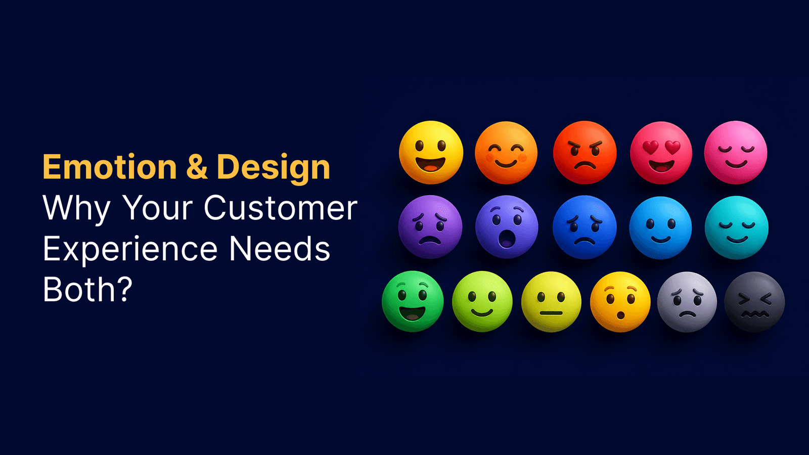
Color psychology and emotional response
Beyond mere esthetics, colors trigger specific emotional responses that significantly impact user experience. Warm colors like red evoke excitement and urgency, while cool colors like blue convey calmness and trust. Notably, specific color-emotion associations appear somewhat universal—68% of people associate red with love, 52% connect yellow with joy, and 51% link black with sadness.
These associations make color a strategic tool in human psychology design. Financial institutions often choose blue to communicate trustworthiness, while environmental organizations typically select green to reflect sustainability values.
Shape psychology and brand perception
Different shapes communicate distinct psychological meanings that subtly influence brand perception. Circles symbolize unity and harmony, creating feelings of safety and inclusion. Square shapes suggest stability and professionalism, while triangles communicate direction, power, and growth.
Leading brands strategically employ these psychology design types in their visual identities. Target’s circular logo represents inclusivity, Microsoft’s squares convey structure and reliability, and Adidas’s triangular elements suggest progression and achievement. Through thoughtful selection of shapes, designers can forge stronger emotional connections between users and interfaces.
Emotional connection through simplicity
Simplicity stands as the bridge between design and emotional resonance. In a digital world crowded with information and visual noise, minimalism continues to gain appeal not just for its esthetics, but for its psychological impact on users.

How simple design builds trust?
Minimalist interfaces fundamentally reduce cognitive load, creating environments that feel ordered and intentional. Research shows that clutter-free environments help lower stress and enhance mental clarity. When users encounter a clean, organized interface, they perceive professionalism and credibility—core elements of trust. First impressions matter tremendously; a polished UI immediately signals credibility even before users engage with content.
Storytelling through minimal visuals
Paradoxically, simplicity amplifies emotional connection. Minimalist design creates space for users to transfer their own emotions to what they see, resulting in more personal, powerful connections. A single line or shape can evoke profound emotional responses, as demonstrated by iconic logos like Apple and Nike. Indeed, minimalism employs strategic symbolism—a drop of water might express sadness, loss, or hope depending on context.
Designing with empathy and accessibility in mind
Empathy in psychology design means truly understanding users‘ needs, challenges, and contexts. Simplified interfaces naturally become more accessible, avoiding the pitfalls of complex storytelling that excludes portions of your audience. Beyond mere compliance, accessible psychology in design creates experiences that resonate universally, with simplified layouts benefiting users across ability levels.
Applying psychology to improve user experience
“Adding features that have little to no value to most users undermines people’s innate abilities to collect and process information efficiently. Keeping the number of options at a reasonable level allows people to make decisions more easily and complete tasks faster.” — UCDA Editorial Team (citing design psychology research), University & College Designers Association; authority in design education
Effective application of psychology design transforms good interfaces into exceptional experiences. Much like architects refine buildings, designers must continuously adapt their creations based on human behavior.

Using feedback to refine design
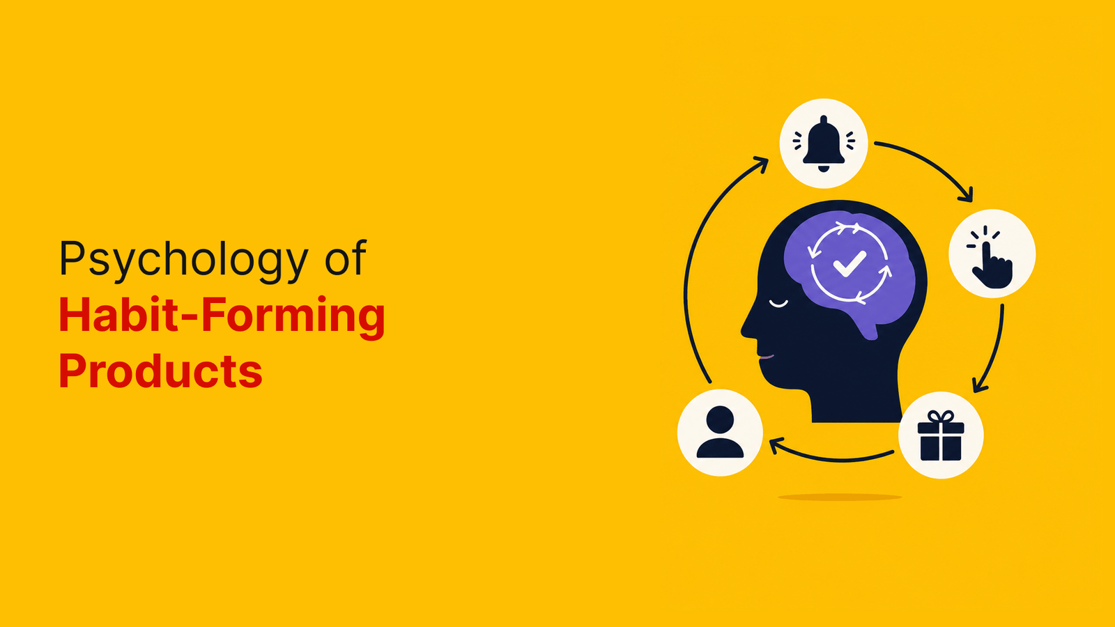
Insufficient feedback represents one of the most serious interface design mistakes. Users require immediate, subtle, and understandable responses to their actions, especially during crucial tasks like online purchases or payments. Without proper feedback, users become uncertain whether their actions registered correctly, potentially abandoning checkout processes or creating multiple orders by mistake. Feedback serves as a bridge between designers’ intentions and users’ actual experiences, enhancing usability and driving innovation when implemented effectively.
Creating personality-driven interfaces
Psychology reveals that personality significantly influences how users perceive design efficiency. Different personality types respond uniquely to interface elements, making personality-driven design increasingly valuable. Research shows personality correlates with technology acceptance, therefore adapting interfaces to match users’ psychological traits creates more engaging experiences. Design elements like typography, corner styles, and color schemes can be strategically selected to align with specific personality characteristics.
Aligning design with user archetypes
User archetypes summarize research data into representations of audience clusters, capturing overlapping behaviors, motivations, and pain points. Unlike personas with fictional names and photos, archetypes focus exclusively on behavioral patterns, supporting more inclusive design approaches. Archetypes help designers understand users without demographic labels, thereafter encouraging solutions addressing genuine user needs rather than assumptions.
Avoiding overdesign and feature bloat
Feature bloat occurs when products include unnecessary or overly complex features. To prevent this:
- Set clear goals and objectives as your design roadmap
- Follow design thinking: empathize, define, ideate, prototype, test
- Remember Pareto principle—80% of outcomes come from 20% of effort
- Start with essential features before adding refinements
Ultimately, good design is as little design as possible. Focus on solving real problems instead of creating perfectly polished interfaces that miss the mark.
Conclusion
Simple designs clearly hold significant psychological power. Throughout this exploration, we’ve seen how users form impressions within milliseconds and naturally gravitate toward clean, familiar interfaces. Understanding the psychological underpinnings of design therefore becomes essential for creating experiences that resonate deeply with users.
Our brains work efficiently when interfaces align with established mental models. Gestalt principles explain why we perceive grouped elements as related, while strategic color choices and thoughtful shape selection trigger specific emotional responses. These psychological design fundamentals help explain why minimalist approaches build trust – they reduce cognitive load and create space for personal connection.
Simplicity does not mean sacrificing personality or emotional impact. Actually, the opposite proves true. Stripped-back designs allow users to project their own emotions onto interfaces, creating more meaningful connections. Companies like Apple and Nike demonstrate how minimal visual elements can tell powerful brand stories.
User expectations continue to evolve, though certain psychological principles remain constant. Designs that respect cognitive limitations, provide clear feedback, and align with personality traits will always outperform cluttered alternatives. Feature bloat represents perhaps the greatest threat to effective design – remembering that good design means as little design as possible serves as an excellent guiding principle.
Next time you approach a design project, consider the psychological impact of every element. Simple doesn’t equal basic – rather, simplicity emerges from deeply understanding users and their needs. Your commitment to psychological design principles will undoubtedly create experiences that users appreciate, trust, and return to again and again.
Key Takeaways
Understanding the psychology behind user preferences reveals why simplicity consistently outperforms complexity in digital design, leading to better user experiences and stronger emotional connections.
• Users form opinions in 50 milliseconds – First impressions happen instantly, making clean, simple designs crucial for positive user perception and trust-building.
• Mental models drive expectations – Users approach interfaces with preconceptions from past experiences, so designs should align with familiar patterns to reduce cognitive load.
• Gestalt principles create intuitive layouts – Our brains naturally group related elements through proximity and similarity, making strategic spacing and visual consistency essential for usability.
• Simple designs build emotional trust – Minimalist interfaces reduce stress and cognitive overload while creating space for users to form personal connections with your brand.
• Feature bloat kills user experience – Following the 80/20 rule and focusing on essential features prevents overwhelming users and maintains design effectiveness.
The psychology of design isn’t just about esthetics—it’s about creating experiences that feel natural, trustworthy, and emotionally resonant. When designers understand how users think and perceive visual information, they can craft interfaces that users genuinely appreciate and return to repeatedly.
FAQs
Q1. Why do users prefer simple designs?
Users prefer simple designs because they reduce cognitive load, create a sense of order, and build trust quickly. Clean, minimalist interfaces allow for easier navigation and faster decision-making, leading to a more enjoyable user experience.
Q2. How does color psychology influence user perception in design?
Color psychology plays a significant role in design by evoking specific emotions and associations. For example, blue often conveys trust and calmness, while red can signify excitement or urgency. Designers use this knowledge to create interfaces that align with their brand’s message and user expectations.
Q3. What are Gestalt principles, and how do they apply to design?
Gestalt principles are psychological concepts that explain how humans perceive and organize visual information. In design, these principles (such as proximity, similarity, and closure) help create intuitive layouts by grouping related elements and establishing visual hierarchies, making interfaces more user-friendly.
Q4. How can designers create emotional connections through minimalist designs?
Designers can create emotional connections through minimalist designs by using strategic symbolism and leaving space for users to project their own emotions. Simple, powerful visuals can evoke strong feelings and personal connections, often more effectively than complex designs.
Q5. What is feature bloat, and why should designers avoid it?
Feature bloat refers to the inclusion of unnecessary or overly complex features in a product or interface. Designers should avoid it because it can overwhelm users, increase cognitive load, and detract from the core functionality. Following the principle that good design is as little design as possible helps create more effective and user-friendly experiences.