Did you know users read only about 20% of the text on an average webpage with 600-800 words? Microcopy might seem insignificant, but these small bits of text can make or break your digital product’s success.
What is microcopy in UX? Simply put, it’s the tiny yet powerful text that guides users through their digital journey. From button labels to error messages, these small word choices significantly impact how people interact with your product. For instance, changing a button from “Sign Up” to “Create Your Free Account” has been shown to increase conversion rates by making the action more enticing. Additionally, concise text and scannable copy can improve usability by an impressive 124%.
We’ve all experienced the frustration of filling out forms incorrectly. However, a simple line of microcopy like “Enter date as MM/DD/YYYY” can prevent this entirely. Throughout this article, we’ll explore what microcopy means for your product, why it matters, and how you can use it to build trust, reduce friction, and ultimately create better user experiences. After all, companies that invest in UX writing often see higher engagement and customer retention.
What is Microcopy in UX?

Image Source: UX Planet
Microcopy represents those tiny pieces of text scattered throughout digital interfaces that guide users and shape their experience. The term itself was coined by Joshua Porter in 2009 when his research demonstrated how adding a simple phrase to a checkout form dramatically reduced errors. Since then, these small words have become increasingly recognized as powerful tools in UX design.
Definition and microcopy meaning
Microcopy refers to the short, informative bits of text found on websites, applications, and other digital products. These brief phrases tell users what to do, address concerns, provide context, and contribute to your brand’s overall story. Unlike lengthy content pieces, microcopy includes:
- Button text and labels
- Form placeholders and field instructions
- Error and success messages
- Loading states and tooltips
- Menu labels and navigation text
- Chatbot responses
Essentially, these small text snippets act as a bridge between users and technology, making interactions more intuitive. One helpful way to understand microcopy’s importance is to imagine removing it from a screen—without guiding text, digital products become confusing messes where users wouldn’t know what actions to take.
Difference between UX writing and marketing copy
While both involve crafting words, UX writing and marketing copy serve fundamentally different purposes. UX writing exists primarily to assist users who are already interacting with your product. In contrast, marketing copy aims to persuade potential customers before they’ve made a purchase.
UX writing focuses on clarity and usability, typically appearing within the product interface as buttons, menus, forms, and error messages. Its goal isn’t to sell but to enhance user experience by providing guidance and making processes easier. Furthermore, UX writing measures success through usability testing, task completion rates, and user satisfaction.
Marketing copy, conversely, appears in materials written about the product and concentrates on persuading potential users to “cough up the cash”. This distinction explains why UX writers often work closely with design teams rather than marketing departments.
Why small words matter in digital products
Despite their size, these tiny text elements wield tremendous influence. Consequently, a single word change on a button can measurably affect conversion rates. When Porter added just two words of microcopy to a form, conversions increased by 17.18%.
Microcopy transforms cold, impersonal technology interactions into warmer, more human conversations. Moreover, it builds trust with users by explaining processes, providing reassurance during complex tasks, and creating emotional connections that make users feel valued.
The biggest misconception is that microcopy holds low priority in the design workflow, yet it significantly influences overall user experience quality. Well-crafted microcopy serves multiple critical functions:
- It makes interfaces feel human and friendly
- It guides users through complex processes
- It anticipates and addresses user concerns proactively
- It reinforces brand identity and personality
- It increases engagement and conversion rates
Effective microcopy doesn’t just help users navigate—it creates memorable experiences that strengthen relationships between users and products. Through concise, clear language, these small words collectively determine a user’s journey and satisfaction with digital products.
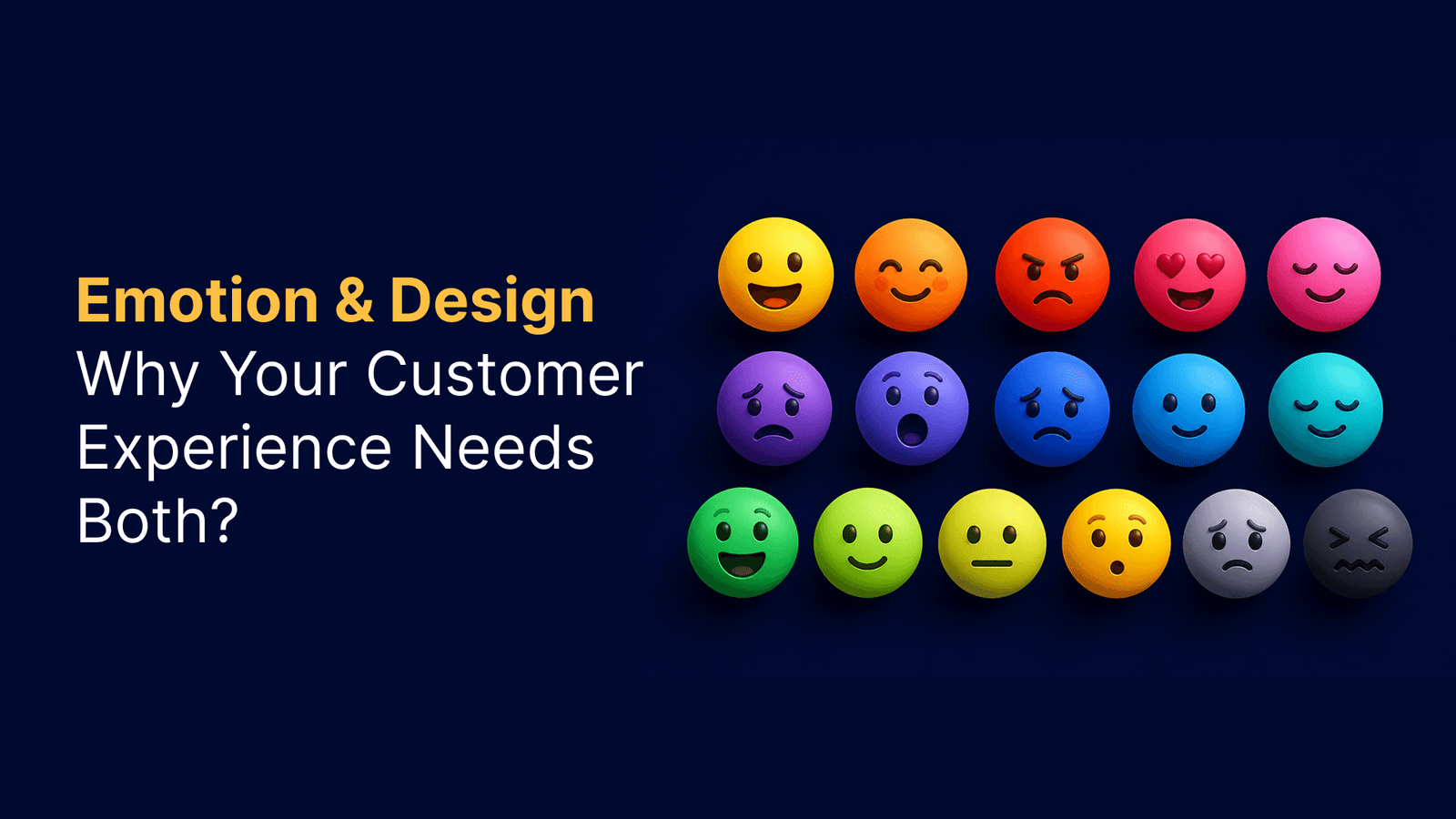
Why Microcopy Matters for User Experience?

Image Source: Toptal
Beyond mere words, effective microcopy serves as the invisible guide shaping how users interact with your product. Although small in size, these tiny text elements have a significant impact on user behavior, perception, and ultimately, your product’s success.
Improves clarity and reduces friction
Clarity is essential in microcopy. When users encounter unclear or confusing text, they often become frustrated and disengaged. Specifically, well-crafted microcopy removes ambiguity, making interfaces feel intuitive and easy to navigate.
Consider form completion, for example. A field requiring a specific date format that doesn’t provide guidance upfront typically leads to errors and frustration. Alternatively, including simple instructions like “Enter date as MM/DD/YYYY” prevents this problem entirely. Indeed, microcopy serves as a guide when users take specific actions, such as searching for products or completing purchases.
Microcopy also lowers users’ cognitive load by eliminating uncertainty. As a result, users spend less mental energy figuring out what to do next. This reduction in friction is particularly important at critical moments – like checkout processes or form completion – where users might otherwise abandon their journey.
Builds trust and brand personality
Trust develops through consistent, reassuring, and informative communication. Particularly during emotionally charged moments – entering payment details, creating accounts, or granting permissions – users look for evidence that the product understands their concerns.
Numerous studies show that addressing privacy concerns directly through microcopy significantly increases form completion rates. For instance, many users feel uncomfortable providing phone numbers without explanation. Notably, adding simple text like “We’ll only use this for order updates” can ease these worries. Similarly, during checkout processes, reassuring messages such as “Your payment is secure” make users comfortable enough to proceed.
Even subtle changes can dramatically impact emotional experiences: a clear confirmation message, an explanation of what happens next, or reassurance that changes are reversible completely transforms how users perceive your brand. Undoubtedly, through these small interactions, microcopy shapes how users interpret and experience a brand in moments that genuinely matter.
Drives user engagement and conversions
The impact of microcopy on conversion rates is measurable and often remarkable. A study found that changing a button from “Request a quote” to “Request pricing” increased clicks by 166.66%. Likewise, adding “No credit card required, cancel anytime” beneath a free trial CTA effectively addressed customer concerns about billing practices.
Microcopy positively influences user behavior in several key ways:
- Encouraging action: Clear, action-oriented copy makes users more likely to engage with your product
- Providing feedback: Positive reinforcement makes users feel connected and more likely to continue engaging
- Easing anxiety: Addressing the “monkey brain” with reassuring microcopy helps users feel at ease, improving conversions
- Setting expectations: Telling users exactly what will happen next builds confidence
The checkout experience especially benefits from thoughtful microcopy. According to Yoast’s behavioral scientist, adding “(there will be no additional costs)” text near the total amount addressed the #1 reason people abandon shopping carts: hidden costs. This simple addition, alongside streamlining the cart experience, measurably increased completed purchases.
Increasingly, businesses recognize that microcopy isn’t just functional—it’s a strategic asset that shapes emotional reactions, eases moments of uncertainty, and quietly supports users through their tasks.
Where Microcopy Appears in the User Journey?

Image Source: UXCam
Throughout the digital product journey, microcopy serves as a silent guide at crucial touchpoints. These small bits of text appear precisely when users need direction, reassurance, or feedback. Let’s explore where these tiny yet powerful words make their biggest impact.
Onboarding and first-time use
First impressions matter. When users initially encounter your product, microcopy helps establish tone and expectations. Welcome messages greet new users, setting the foundation for the entire experience. For instance, “Welcome to our app! Here’s a quick tour to get you started” immediately orients users to what comes next.
Onboarding microcopy appears in:
- Tutorial overlays explaining key features
- Contextual hints highlighting important elements
- Progress indicators showing completion stages (“You’re on step 3 of 6 – keep going!”)
Forms, inputs, and tooltips
Forms represent critical interaction points where users frequently need guidance. Effective microcopy here reduces errors and frustration. Text fields require several microcopy elements: labels telling users what information belongs in each field, placeholder text providing examples, and helper text offering additional context or validation messages.
Tooltip text informs users by providing clarification when hovering over unfamiliar terms or symbols in the interface. Additionally, inline validation messages (like “That password doesn’t match our records”) help users correct mistakes immediately rather than after submission.
Call-to-action buttons
CTAs drive user behavior throughout the product experience. Button text should clearly communicate what happens when clicked. Instead of generic “Submit” labels, descriptive action-based words like “Create my account” or “Send information” perform better. Studies show first-person phrasing (“Create my account” vs. “Create account”) often yields higher conversion rates.
Micro-CTAs—subtle nudges placed inside UX elements—reduce friction and increase interaction. Examples include “Show me more,” “Expand this section,” or “Try the demo first.”
Error and success messages
These messages appear at emotionally charged moments when users need clear direction. Error messages should avoid blame, explain what happened, and provide next steps. Instead of “Error 504: Gateway Timeout,” better microcopy might read “Looks like our servers are taking a break. Please try again in a moment.”
Success messages confirm completion and guide users forward. Rather than generic “Success!” statements, specific confirmations like “Your profile has been updated” provide clarity while maintaining momentum.
Loading states and empty screens
Often overlooked, these moments offer valuable opportunities for engagement. Loading messages keep users informed during wait times (“Hold on tight! We’re getting your results—shouldn’t take more than a minute”).
Empty states—screens without content—can frustrate users if poorly handled. Good microcopy explains why nothing appears yet and suggests next actions: “No messages yet. Start a conversation by saying hello to your first match!” This transforms potential confusion into guided engagement.
Best Practices for Writing Effective Microcopy
Crafting effective microcopy requires precision and thoughtfulness. The tiny text elements that guide users through your product deserve as much strategic consideration as your overall UX design. Let’s explore the key practices that make microcopy truly effective.
Be clear and concise
First and foremost, clarity trumps creativity when writing microcopy. Users need to understand, not be impressed by clever wordplay. Removing unnecessary words should be done ruthlessly – transform “In order to” into simply “to” and eliminate phrases like “Please be aware that” entirely.
Keep sentences short and snappy with no more than 5-8 words per sentence. This approach benefits all users, including those with cognitive impairments, older adults, and international users. On one hand, you want to be brief, yet on the other hand, never sacrifice important information just to keep it short.
Use a conversational tone
Many people confuse “conversational” with “casual” in microcopy. In essence, conversational simply means writing how a human would talk, not like a computer. It doesn’t mean using slang or writing like a teenager texts.
The best brand voices use language that sounds natural when read aloud. Would you actually say those words to someone sitting beside you? If it feels stilted when spoken, it likely won’t work well in your interface.
Provide helpful context
Users should never wonder why a particular action is needed. Good microcopy anticipates questions and provides context that improves experience. For instance, replace vague error messages like “Invalid entry” with specific guidance: “Please enter a valid email address (e.g., example@email.com)”.
Importantly, well-timed contextual elements can transform frustrating moments. When a system waits until someone finishes typing before gently flagging an issue, it feels supportive rather than interruptive.
Write action-oriented copy
Regardless of where it appears, microcopy should focus on actions. Users want to be efficient with their time. Use verbs or verb phrases that clearly outline what happens after a command is selected.
Avoid generic button labels like “OK” in confirmation dialogs – users might select it out of habit without reading. Certainly, being specific about actions helps users make confident decisions.
Use empathy and reassurance
The most underestimated power of microcopy is building trust through empathy. Good microcopy translates technical states into human ones, acting as an interpreter between machine and person. When microcopy acknowledges emotions and provides solutions, it creates meaningful connections.
Studies show that companies prioritizing emotional design experienced a 20% increase in customer satisfaction. Applying this to microcopy means adding reassurance in moments of uncertainty, like: “We’ve received your message. Our team will get back to you within 24 hours”.
Common Mistakes to Avoid in Microcopy UX

Image Source: Plerdy
Even expert writers can fall into common microcopy traps that undermine user experience. Learning to recognize these pitfalls helps create interfaces that truly connect with users.
Being too vague or robotic
Vague descriptions or translations can ruin the entire user journey of an application. Error messages like “Invalid input” fail to tell users what went wrong or how to fix it. Alternatively, a robotic tone makes users feel disconnected, reducing trust. Compare “Processing request. Please wait” with the warmer “Hang tight! We’re getting things ready for you”.
Overloading with unnecessary text
Every instruction creates conflict: avoiding text overload versus providing answers to potential questions. Users typically scan content and prefer straightforward language. Overwhelming users with information increases cognitive load, making them more likely to abandon forms. Remember the balance between being “clean” versus being helpful—if a minimal design makes life harder for users, it defeats its purpose.
Ignoring accessibility and inclusivity
Accessible writing ensures all users can navigate your product seamlessly. Avoid phrases like “Click the green button” or spatial references such as “As seen above” which create barriers for screen reader users. Implementing accessibility practices means using alt text for images, navigable keyboards, and sufficient contrast for readability.
Using confirmshaming or misleading CTAs
Confirmshaming works by guilting users into compliance. Examples include buttons like “No thanks, I hate saving money” when declining offers. This manipulative approach violates trust and feels condescending. Instead, opt for neutral language like “No, I’m good” that remains conversational without being insulting. Descriptive, honest CTAs build credibility—the button text should accurately reflect the action.
Conclusion
Microcopy might appear small, but its impact on user experience remains significant and far-reaching. Throughout this article, we’ve seen how these tiny text elements serve as silent guides that help users navigate digital interfaces while building trust and encouraging action.
Small word changes can dramatically transform how people interact with your product. Therefore, treating microcopy as a strategic asset rather than an afterthought becomes essential for product success. The evidence speaks for itself – buttons with clearer labels increase click rates, reassuring text near checkout forms boosts conversions, and helpful error messages reduce frustration.
Most importantly, effective microcopy creates human connections within digital experiences. Users appreciate when products speak to them conversationally, anticipate their concerns, and provide timely guidance. This emotional connection ultimately translates into higher engagement, better retention, and stronger brand loyalty.
Remember that great microcopy balances brevity with helpfulness. Though keeping text concise matters, providing necessary context and reassurance should never be sacrificed for minimalism. Additionally, writing with empathy ensures your interface communicates with users rather than at them.
The next time you review your digital product, pay close attention to those small bits of text. Ask yourself: Do they clearly guide users? Do they address potential concerns? Do they reflect your brand personality? Making thoughtful improvements to your microcopy will undoubtedly enhance user experience and business outcomes.
Your product deserves microcopy that works as hard as your design and functionality. After all, the right words at the right time make all the difference between a frustrating interaction and a delightful experience that keeps users coming back.
Key Takeaways
Microcopy—the small text elements throughout digital interfaces—can dramatically improve user experience and business outcomes through strategic word choices.
• Small changes yield big results: Simple microcopy tweaks like changing “Sign Up” to “Create Your Free Account” can increase conversions by 17-166%
• Clarity reduces friction: Clear instructions like “Enter date as MM/DD/YYYY” prevent user errors and eliminate cognitive load during critical tasks
• Trust builds through reassurance: Adding context like “We’ll only use this for order updates” addresses user concerns and increases form completion rates
• Action-oriented language drives engagement: Specific button text like “Create my account” outperforms generic labels and encourages user action
• Empathy transforms interactions: Conversational, helpful microcopy turns cold digital experiences into human connections that boost satisfaction by 20%
When crafted thoughtfully, microcopy serves as an invisible guide that anticipates user needs, addresses concerns proactively, and creates memorable experiences. These tiny words collectively determine whether users feel frustrated or delighted with your product.
FAQs
Q1. What is microcopy in UX design?
Microcopy refers to the small pieces of text in digital interfaces that guide users through their experience. It includes button labels, form instructions, error messages, and other short text elements that help users navigate and interact with a product.
Q2. How can microcopy improve user experience?
Effective microcopy can improve clarity, reduce friction, build trust, and drive user engagement. It helps users understand what to do, addresses their concerns, and makes interfaces feel more intuitive and user-friendly.
Q3. Where does microcopy typically appear in digital products?
Microcopy appears throughout the user journey, including during onboarding, in forms and input fields, on call-to-action buttons, in error and success messages, and on loading and empty states.
Q4. What are some best practices for writing effective microcopy?
Key practices include being clear and concise, using a conversational tone, providing helpful context, writing action-oriented copy, and incorporating empathy and reassurance in your text.
Q5. How can small changes in microcopy impact conversion rates?
Small changes in microcopy can significantly impact conversion rates. For example, changing a button from “Request a quote” to “Request pricing” has been shown to increase clicks by over 166%. Adding reassuring text like “No credit card required” near free trial offers can also boost conversions by addressing user concerns.