Did you know users form impressions about your website in just 50 milliseconds?
That’s right – half a second could be undermining your efforts to improve conversion rates before visitors even interact with your content.
We’ve all been there – pouring hours into website optimization only to wonder why visitors aren’t converting. Surprisingly, 93% of users’ first impressions are design-related, yet 76% of websites have poor or mediocre navigation systems. In fact, a single second of delay in page load time can slash conversions by 7%. Additionally, with mobile devices now accounting for over 63% of global internet traffic, optimizing your landing page to improve conversion rates is no longer optional – especially when 57% of customers won’t recommend businesses with poorly designed mobile sites.
Throughout this guide, we’ll explore the seven hidden UX mistakes that are silently sabotaging your conversion potential, along with practical tips to improve conversion rates quickly. These aren’t theoretical concepts – they’re battle-tested solutions for real-world issues we’ve encountered while helping clients improve conversion rates on landing pages across various industries.
Overcomplicated Navigation
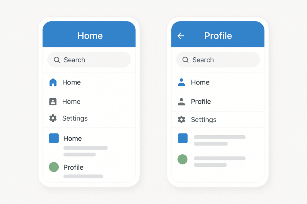
Navigation might seem like a minor component of your website, but research shows that 94% of users believe your website needs to be easy to navigate. Furthermore, if your navigation isn’t up to par, 38% of visitors will immediately stop engaging with your site.
What is overcomplicated navigation?
Overcomplicated navigation occurs when a website’s menu system becomes confusing, cluttered, or difficult to use. This happens when:
- Your menu contains too many options (exceeding 7 items)
- Navigation elements are hidden behind hamburger menus on desktop
- Labels are vague, inconsistent, or use internal jargon
- Dropdown menus are nested too deeply (more than two tiers)
- Navigation differs across devices
As one usability expert notes, attempting to navigate a poorly structured website is like “being dropped in the middle of a complex maze with no map and no frame of reference”. Consequently, this creates an overwhelming and frustrating experience that significantly damages your conversion potential.
Why overcomplicated navigation hurts conversions?
Complex navigation creates what psychologists call “The Paralyzing Problem of Too Many Choices”. When visitors face too many options, they experience higher cognitive load, leading to:
- Increased bounce rates – A confusing or difficult-to-use navigation system discourages customers and makes them more likely to abandon their shopping carts
- Decreased page authority – The more navigation links you include, the lower the authority of each, negatively impacting your SEO ranking
- Reduced content discovery – Hidden navigation items force visitors to spend more time searching for what they need, increasing frustration
According to studies, once you exceed seven navigation items, people stop reading and start scanning, potentially missing information critical to conversion. Seven seems to be the magic number—go above, and user confusion multiplies.
Example of poor navigation
Let’s examine a common navigation mistake: the overuse of hamburger menus on desktop sites. Despite their popularity in minimalist designs, hamburger menus harm usability because:
- They hide critically important content from visitors
- They force users to click twice on every page, adding time and frustration
- Only 52% of users over 45 know what the hamburger icon means
- They negatively impact your SEO and website accessibility
Another example is organizing content by format (videos, articles, whitepapers) rather than by topic. This approach makes logical sense in marketing meetings but fails users who visit websites looking for answers and information—not specific content formats.
Quick fix for overcomplicated navigation
To improve conversion rates on your website, implement these navigation fixes:
- Limit main navigation to 5-7 items – This creates an optimal balance between providing sufficient options without overwhelming users
- Make navigation visible – Avoid hiding navigation behind hamburger menus on desktop. As UX experts note: “Out of sight means out of mind”
- Use clear, descriptive labels – Replace vague or jargon-filled terms with simple, intuitive options that accurately reflect page content
- Indicate current location – Show users where they are in your site structure—failing to do this is “probably the single most common mistake” in website menus
- Ensure consistent cross-device navigation – While submenus may vary, primary controls should remain the same across all devices and screen sizes
Tools to test navigation usability
Implementing effective navigation requires understanding how users actually interact with your site. These tools can help:
Heatmap Tools: Platforms like Hotjar and Mouseflow provide color-coded visualizations showing where users click, how far they scroll, and what they ignore. These insights help determine if visitors reach important content, follow your main navigation links, or experience issues across devices.
Session Recording: These recordings show exactly how visitors move through your site, revealing navigation pain points that might not be obvious from analytics data alone.
A/B Testing Tools: Test different navigation structures to see which performs better for conversions. These tools help you “sell a hypothesis or test plan to stakeholders while reducing risk”.
Usability Testing Platforms: Services like Maze allow you to conduct moderated or unmoderated tests where users attempt specific navigation tasks, providing qualitative insights into your navigation’s effectiveness.
By simplifying your navigation structure, you not only improve the user experience but also directly boost your conversion potential. Remember, every additional click required represents another opportunity for visitors to abandon their journey toward conversion.
Unclear Call-to-Actions (CTAs)
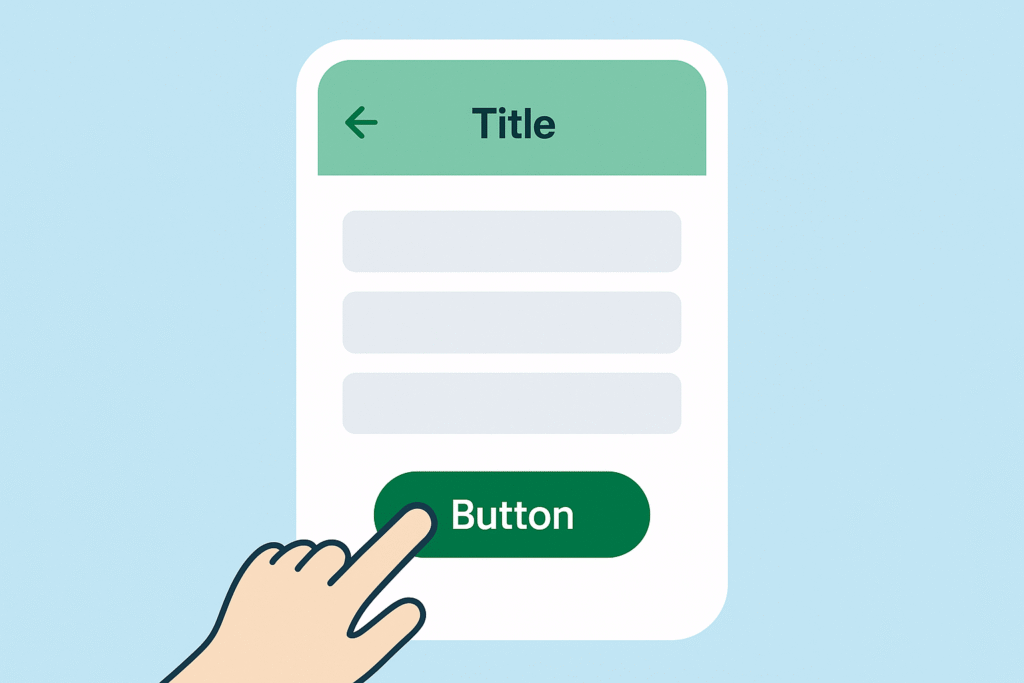
Calls-to-action (CTAs) represent the critical tipping point where visitor interest potentially transforms into measurable action. Studies reveal that 70% of small businesses have websites with no CTAs on their homepage, leaving conversion opportunities completely untapped.
What are unclear CTAs?
Unclear CTAs occur when your action prompts fail to effectively communicate what happens next or why users should click. These problematic elements typically include:
- Vague button text like “Click Here” or “Submit” without context
- CTAs that don’t clearly articulate the value proposition
- Buttons competing for attention (multiple primary CTAs)
- Poor positioning that requires excessive scrolling
- CTAs misaligned with landing page content
Essentially, unclear CTAs create hesitation at precisely the moment you need decisive action, ultimately leading visitors to abandon their journey entirely.
Why unclear CTAs reduce conversions
The impact of unclear CTAs extends far beyond esthetic concerns. Research consistently shows they directly undermine conversion potential:
- Visitor confusion leads to abandonment – When users can’t immediately understand what clicking a button will do, they experience decision paralysis
- Missed value communication – CTAs that fail to articulate benefits give users no compelling reason to act, resulting in a 201% lower conversion rate compared to value-focused alternatives
- Competing options create indecision – Multiple prominent CTAs force users to choose, yet studies show that increasing choices actually decreases the likelihood of action
- Mobile optimization failures – CTAs not optimized for mobile devices create frustration for the 63% of users accessing your site via mobile
- Location problems – Improperly placed CTAs receive significantly fewer clicks, with studies showing a 62% conversion rate increase when CTAs gain prominence
Example of ineffective CTA
Consider a common ineffective CTA scenario: a software company using generic “Learn More” buttons throughout their website. This approach fails for several reasons:
- The phrase doesn’t communicate value (what will I learn?)
- It lacks specificity about what happens after clicking
- The generic wording fails to create urgency or excitement
- It misses the opportunity to address the user’s specific needs
In another real-world example, TechSmith discovered through click map analysis that users were completely ignoring their CTA text buttons, preferring instead to click on product images. This insight revealed a critical disconnect between the company’s intended conversion path and actual user behavior.
Quick fix for CTAs
To immediately improve your CTAs and boost conversion rates:
- Use specific, action-oriented language – Replace vague terms with clear, descriptive verbs that indicate exactly what happens (e.g., “Download Free Guide” instead of “Click Here”)
- Communicate clear value – Focus on what users gain, not what they do (e.g., “Get 50% Off Today” rather than “Subscribe”)
- Create visual prominence – Ensure your CTA stands out through contrasting colors, adequate white space, and appropriate sizing
- Position strategically – Place CTAs where users naturally focus attention, as revealed by heatmap analysis
- Limit competing options – Include one primary CTA per section to avoid decision paralysis
- Ensure mobile optimization – Test all CTAs across devices to verify they remain clickable and visible on smaller screens
Tools to A/B test CTAs
Implementing effective A/B testing for your CTAs requires the right tools:
Heatmap Analysis Tools like Hotjar or ContentSquare provide visual representations of how users interact with your CTAs. These tools reveal if visitors see your CTAs, attempt to click non-clickable elements, or ignore critical conversion elements entirely.
A/B Testing Platforms such as VWO or Optimizely allow you to compare different CTA variations by splitting traffic between versions and measuring which performs better. Material Market used this approach to reposition their CTA button based on scroll map data, resulting in a 1.1% conversion rate increase worth £10,000+ in yearly revenue.
Analytics Integration with Google Analytics helps track CTA performance across segments and understand the broader impact of your tests.
Cross-Device Testing Tools like BrowserStack ensure your CTAs function consistently across all devices, browsers, and operating systems.
By addressing these common CTA issues, you can create clear pathways to conversion that guide visitors exactly where you want them to go—and where, ultimately, they want to be.
Slow Page Load Speed
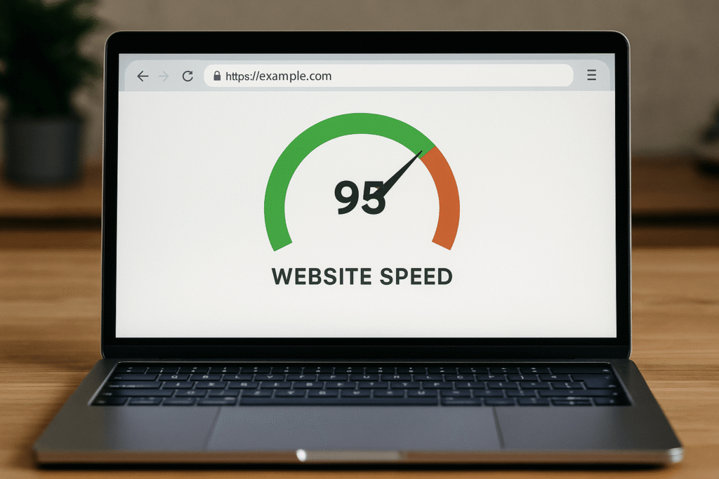
In a digital world where patience is scarce, every millisecond counts. Page load speed remains one of the most overlooked yet critical factors affecting website performance, with research showing that the average webpage takes about 3.21 seconds to load, yet users expect pages to load in 2 seconds or less.
What is slow page speed?
Page load speed refers to how quickly your website content renders in a visitor’s browser. Technically speaking, it measures the time between a browser sending a request to your server and the complete rendering of the page. Generally, any page that takes longer than 2-3 seconds to load is considered slow, with Google’s John Mueller confirming that 3 seconds is the limit most visitors are willing to wait.
Modern websites face increasing challenges with page speed as average page sizes continue to grow with more complex elements. Nevertheless, visitor expectations haven’t changed—they still want instant results.
Why slow speed kills conversions?
The relationship between page speed and conversions is both direct and dramatic. Consider these sobering statistics:
- When page load time increases from 1 to 3 seconds, the probability of bounce increases by 32%
- At 5 seconds load time, the probability of bounce skyrockets to 90%
- Pages loading within 2 seconds experience an average bounce rate of just 9%, while those taking 5 seconds reach a staggering 38%
- For every 1 second improvement in page load time, conversions can increase by 2%
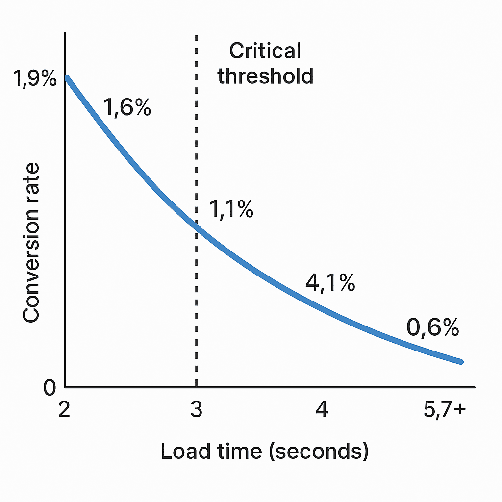
Perhaps most compelling is the data from mPulse Mobile showing that pages loading in 2.4 seconds had a 1.9% conversion rate, while those taking 5.7+ seconds saw conversion rates plummet to merely 0.6%.
This creates a straightforward equation: faster pages = more conversions. Subsequently, every second saved translates directly to revenue gained.
Example of slow-loading site
Renault, the global automaker, discovered this relationship firsthand when optimizing their website performance. Prior to optimization, their slow-loading pages were driving away potential customers. Specifically, after reducing their largest page elements to load under 1 second, Renault decreased its bounce rate by 14% while simultaneously increasing conversions by 13%.
Similarly, NDTV (a major news website) improved loading time by 55%, resulting in a 50% reduction in bounce rate as visitors stayed engaged with faster content.
Quick fix for improving speed
To immediately boost your page speed and improve conversion rates:
- Optimize images – Compress them without sacrificing quality using tools like TinyPNG
- Minimize HTTP requests – Combine CSS and JavaScript files to reduce server calls
- Enable browser caching – Let returning visitors load resources locally
- Use a Content Delivery Network (CDN) – Cache content globally to reduce physical distance to users
- Minimize code – Remove unnecessary comments, whitespace, and semicolons
- Upgrade hosting – Choose servers with response times under 200ms
Primarily focus on reducing the largest content elements first, as they typically create the most significant delays.
Tools to measure page speed
Monitoring your progress requires reliable measurement tools:
- Google PageSpeed Insights – The gold standard for testing Core Web Vitals
- GTmetrix – Provides detailed recommendations and testing from various global locations
- WebPageTest – Offers advanced configuration options for comprehensive analysis
- Lighthouse – Built into Chrome DevTools for quick audits
- Pingdom – Similar to GTmetrix with multiple testing locations
Remember that scoring 100/100 in these tools doesn’t guarantee real-world performance. Indeed, focus on field data showing how actual users experience your site rather than just lab scores.
By prioritizing page speed optimization, you not only satisfy user expectations but directly impact your bottom line. Overall, few conversion improvements offer as clear an ROI as reducing those precious seconds your visitors spend waiting.
Poor Mobile Optimization
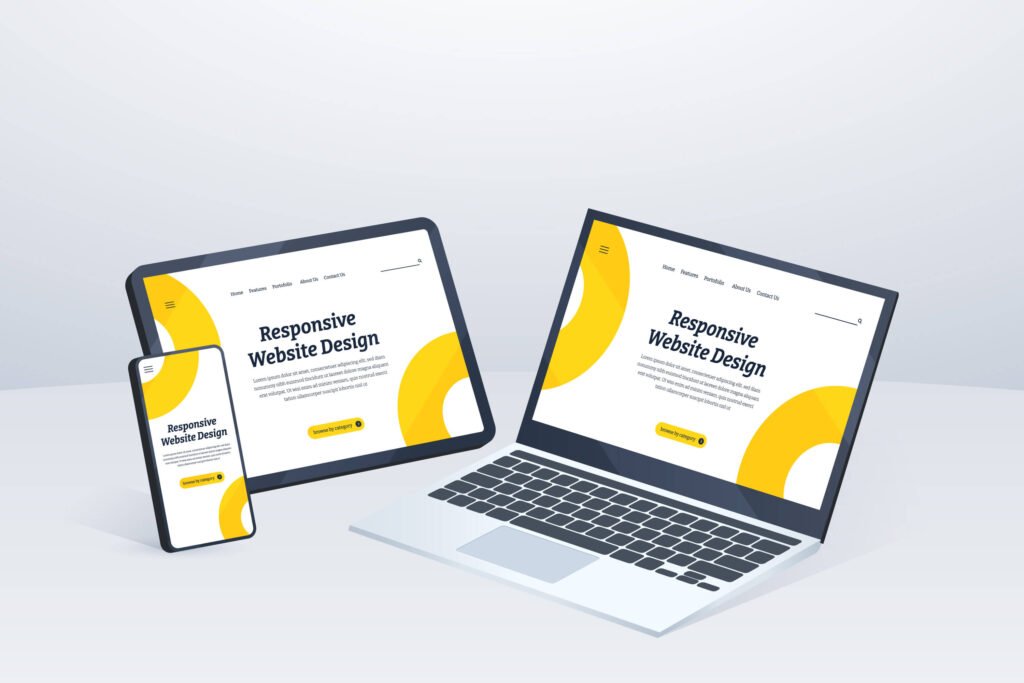
Mobile browsing now dominates the digital landscape, with over 55% of global website traffic coming from mobile devices. Yet many businesses continue to treat mobile optimization as an afterthought, creating a massive conversion gap in their marketing efforts.
What is poor mobile UX?
Poor mobile user experience encompasses any aspect of your mobile interface that frustrates, confuses, or prevents users from completing desired actions. This typically includes:
- Unresponsive designs that don’t adapt to screen sizes
- Touch targets (buttons, links) smaller than 44px, making them difficult to tap
- Overloaded screens with excessive content
- Performance issues and slow loading times on mobile networks
- Cluttered interfaces requiring pinching or horizontal scrolling
Notably, mobile UX isn’t simply shrinking your desktop site—it requires a fundamental rethinking of how users interact with smaller screens.
Why mobile optimization matters in 2025?
Mobile optimization directly impacts your bottom line for several reasons. First, 74% of users are more likely to return to mobile-friendly websites, creating opportunities for repeat conversions. Moreover, 57% of users won’t recommend a business with a poorly designed mobile presence, affecting your word-of-mouth marketing.
From an SEO perspective, Google now uses mobile-first indexing, meaning it primarily uses your mobile site for ranking purposes. Beyond that, 53% of mobile users abandon sites taking longer than three seconds to load, creating an immediate conversion barrier.
Example of bad mobile experience
A common poor mobile experience involves non-responsive forms. When desktop forms are simply transferred to mobile without optimization, users encounter tiny form fields, difficult-to-tap dropdown menus, and frustrating keyboard experiences.
Another frequent issue is navigation menus designed for mouse clicks rather than thumb taps. Given that 49% of users prefer using mobile phones with just one thumb, interfaces that ignore this behavior create immediate friction.
Quick fix for mobile UX
To quickly improve your mobile experience and conversion rates:
- Implement mobile-first design that prioritizes essential content first
- Create clear, focused layouts with vertical scrolling rather than horizontal
- Make all tap targets at least 44px wide to avoid user frustration
- Optimize performance specifically for slower mobile connections
- Test real-world usage with actual devices, not just desktop simulators
Tools to test mobile responsiveness
Several tools help identify and fix mobile responsiveness issues:
- Google’s Mobile-Friendly Test – Provides basic mobile compatibility assessment
- BrowserStack – Tests across 2000+ real devices and browsers
- Screenfly – Offers testing on multiple screen sizes with rotation options
- Responsinator – Provides a simple interface for quick responsive testing
- LTBrowser – Allows testing across 27+ devices with custom device options
By focusing on mobile optimization, you’ll not only improve user experience but directly increase your website’s conversion potential across the majority of your traffic.
Cluttered User Interface

Research from Princeton University reveals that cluttered interfaces directly limit your brain’s ability to process information, restricting focus and hampering decision-making. This invisible barrier between your visitors and conversion actions costs businesses thousands in lost revenue.
What is a cluttered UI?
A cluttered user interface occurs when your website contains an overabundance of visual elements competing for attention without clear organization or hierarchy. This typically manifests as:
- Too many interface components in limited space
- Information without clear structure or organization
- Over-embellished typography and decorative elements
- Competing visual elements and conflicting color palettes
- Insufficient white space between elements
The fundamental issue isn’t necessarily having too much information, but rather presenting it in ways that overwhelm the visitor’s cognitive capacity.
Why clutter confuses users?
Clutter directly impacts conversion rates by increasing cognitive load—the amount of working memory required to process your interface. When researchers analyzed brain activity using fMRI scans, they discovered cluttered interfaces literally restricted users’ ability to focus and process information.
Beyond the neurological impact, cluttered designs create several conversion barriers:
- Impaired visual scanning patterns (users often scan in F or Z patterns)
- Reduced esthetic appeal (people rate cleaner interfaces as more trustworthy)
- Increased decision paralysis (more options decrease likelihood of choice)
- Difficulty identifying primary actions and CTAs
Studies consistently show that people find interfaces visually attractive when they can be easily processed by the brain based on symmetry, cleanliness, and clear proportions.
Example of visual overload
Common examples of visual overload include:
- E-commerce product pages with excessive filters, options, and related items
- Landing pages with competing calls-to-action and multiple value propositions
- Form pages with unnecessarily complex inputs and redundant fields
- Websites with inconsistent spacing between elements, creating visual tension
Quick fix for UI clarity
To immediately improve your interface clarity and conversion rates:
- Implement grid layouts to create structured alignment
- Increase white space around important elements (especially CTAs)
- Remove decorative elements that don’t serve a functional purpose
- Establish clear visual hierarchy through size, color and contrast
- Use progressive disclosure to reveal information only when needed
- Limit your color palette to create visual cohesion
Tools to analyze visual hierarchy
Several tools can help identify and fix visual hierarchy issues:
- Squint test – Blur your vision to see if important elements still stand out
- Five second test – Show users your design for five seconds, then ask what they remember
- Heatmap analysis – Use tools like Hotjar to see where users actually look and click
- Visual hierarchy checkers – Tools like Stark help verify contrast and accessibility
Inaccessible Design

Nearly 16% of the global population lives with permanent disabilities, yet many websites continue to create barriers through inaccessible design, potentially excluding millions of visitors and sabotaging conversion opportunities.
What is inaccessible UX?
Inaccessible UX occurs when websites fail to accommodate users with disabilities. Common issues include:
- Missing alternative text for images (31.3% of global homepages lack alt text)
- Poor color contrast between text and background
- Improper website hierarchy and structure
- Ill-formatted form labels and fields
- Non-descriptive links that confuse screen readers
- Lack of keyboard accessibility for non-mouse users
These barriers affect users with visual, auditory, motor, and cognitive impairments, creating frustrating experiences that drive potential customers away.
Why accessibility impacts conversions?
Beyond ethical considerations, inaccessible design directly harms your conversion rates. Research shows that 69% of individuals with disabilities will abandon websites that are difficult to use, yet 90% won’t bother to complain about accessibility problems—they simply leave.
This represents enormous lost revenue potential, considering that people with disabilities hold INR 101.26 trillion in annual disposable income. Furthermore, accessible websites often benefit all users; features like captions help everyone in loud environments, while clear layouts improve usability universally.
Example of poor accessibility
A common accessibility failure involves form fields without proper labels. For screen reader users, encountering unlabeled inputs creates an impossible barrier—they simply cannot determine what information to provide. Likewise, websites with color-dependent instructions exclude the 8% of men with red-green color blindness.
Quick fix for accessibility
To improve conversion rates through better accessibility:
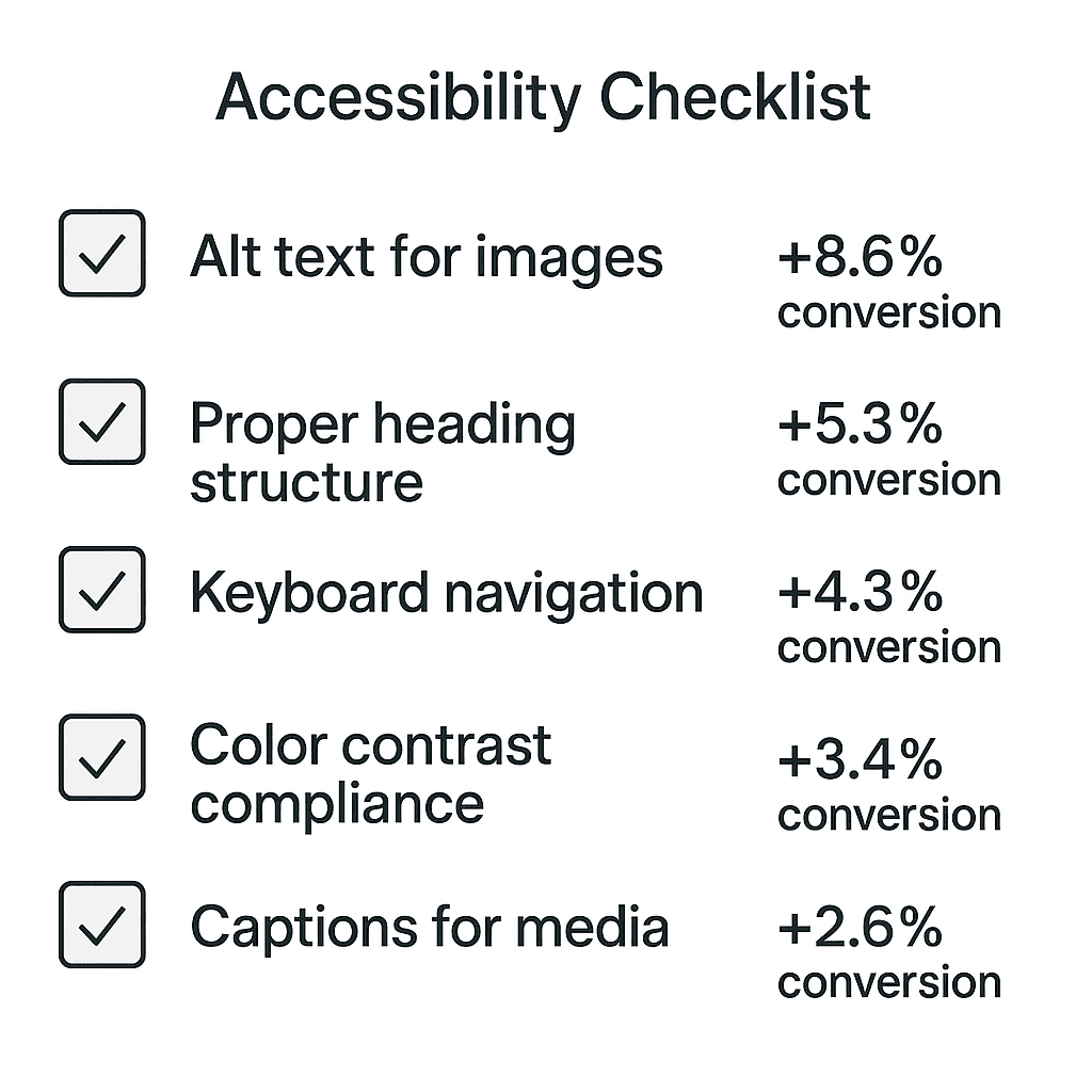
- Add descriptive alt text to all images
- Ensure color contrast ratios of at least 4.5:1 for body text
- Structure content with proper heading hierarchy
- Make all functionality keyboard-accessible
- Provide captions for video content (which increases engagement by 12% for all users)
Tools to audit accessibility
Several tools can help identify and fix accessibility issues:
- Automated scanners: WAVE, Ax DevTools, and Lighthouse quickly identify common violations
- Screen readers: Test with NVDA or VoiceOver to experience your site as visually impaired users do
- Contrast checkers: Verify all text meets WCAG guidelines for readability
- Keyboard testing: Navigate your entire site without a mouse—the “no mouse challenge”
Inconsistent Branding

Brand consistency can increase revenue by 33%, yet many companies struggle to maintain a unified brand presence across different touchpoints. This neglected aspect of UX silently undermines your conversion potential.
What is inconsistent branding?
Inconsistent branding occurs when your brand elements lack cohesion across various platforms and materials. This includes misaligned visual identity (logos, colors, typography), conflicting messaging, or disjointed customer experiences. Primarily, inconsistency sends mixed signals about who you are and what you stand for, creating cognitive dissonance that drives potential customers away.
Why branding consistency builds trust?
Throughout the customer journey, consistent branding functions as a trust signal. When brand messages and offerings are misaligned, potential customers quickly find them bewildering and “rather than trying to sort through mismatched brand messages, they’re likely to move on to a competitor”. Research reveals consistent branding directly impacts revenue—organizations experience an average 23% revenue increase when maintaining brand consistency.
Example of mismatched design
A common branding inconsistency appears when companies use different color schemes or typography across their website, social media, and marketing materials. Consider a company whose website showcases modern, minimalist design while their social media presents cluttered, conflicting visual elements. This disconnect creates what one expert describes as reading “a novel with the pages out of order—disorienting, distracting, and not enjoyable”.
Quick fix for branding alignment
To immediately improve brand consistency and conversion rates:
- Create comprehensive brand guidelines documenting visual elements, tone, and messaging
- Conduct a content audit to identify inconsistencies across platforms
- Develop templates for frequently used assets (blog banners, social posts)
- Educate all departments on brand standards and provide easy access to assets
- Designate a brand manager as a gatekeeper for consistency
Tools to manage brand assets
Fundamentally, managing brand consistency requires specialized tools. Consider implementing:
- Brand asset management software to centralize and standardize materials
- Digital asset management systems (DAM) for organizing and distributing assets
- Brand portals that house guidelines and digital assets in one location
- Online brand guideline platforms (like Frontify) that allow direct asset downloads
Comparison Table
| Issue | Impact on Conversions | Key Statistics | Common Problems | Quick Fixes | Recommended Tools |
|---|---|---|---|---|---|
| Overcomplicated Navigation | Increases bounce rates and reduces content discovery | – 94% users need easy navigation – 38% visitors leave if navigation is poor | – Too many menu options (>7) – Hidden hamburger menus – Vague labels – Deep nested dropdowns | – Limit to 5-7 items – Make navigation visible – Use clear labels – Show current location | – Hotjar – Mouseflow – Maze – A/B testing tools |
| Unclear CTAs | Creates hesitation and abandonment | – 70% of small businesses lack homepage CTAs – 201% lower conversion with unclear value | – Vague button text – Multiple competing CTAs – Poor positioning – Lack of value proposition | – Use specific language – Communicate clear value – Create visual prominence – Limit competing options | – Hotjar – VWO – Optimizely – BrowserStack |
| Slow Page Load Speed | Dramatically increases bounce rates | – 32% bounce increase (1-3s) – 90% bounce at 5s – 2% conversion increase per 1s improvement | – Large unoptimized images – Multiple HTTP requests – No caching – Poor hosting | – Optimize images – Minimize HTTP requests – Enable caching – Use CDN | – PageSpeed Insights – GTmetrix – WebPageTest – Lighthouse |
| Poor Mobile Optimization | Reduces return visits and recommendations | – 55% traffic from mobile – 74% users return to mobile-friendly sites – 57% won’t recommend poor mobile sites | – Unresponsive design – Small touch targets – Overloaded screens – Horizontal scrolling | – Mobile-first design – 44px tap targets – Vertical scrolling – Performance optimization | – Mobile-Friendly Test – BrowserStack – Screenfly – LTBrowser |
| Cluttered User Interface | Limits information processing and decision-making | – Reduces focus ability – Increases cognitive load – Decreases trust | – Too many components – Poor organization – Over-decoration – Insufficient white space | – Use grid layouts – Increase white space – Remove decoration – Clear hierarchy | – Squint test – Five second test – Hotjar – Stark |
| Inaccessible Design | Excludes potential customers | – 69% abandon inaccessible sites – 31.3% lack alt text – 8% color-blind men | – Missing alt text – Poor contrast – Bad form labels – No keyboard access | – Add alt text – Ensure contrast – Structure content – Enable keyboard use | – WAVE – Ax DevTools – NVDA – Contrast checkers |
| Inconsistent Branding | Reduces trust and revenue | – 33% revenue increase with consistency – 23% average revenue boost | – Misaligned visuals – Conflicting messages – Disjointed experiences | – Create guidelines – Conduct audits – Develop templates – Designate manager | – Brand asset management – DAM systems – Brand portals – Frontify |
Conclusion
Final Thoughts
Ultimately, these seven UX mistakes represent significant barriers between your website and its conversion potential. Poor navigation, unclear CTAs, slow page speeds, and the other issues highlighted throughout this guide directly impact your bottom line. Addressing just one of these areas can yield measurable results, while tackling multiple issues creates compound benefits that dramatically improve user experience and conversion rates.
Rather than viewing these fixes as overwhelming technical challenges, consider them opportunities to better serve your visitors. The data clearly shows that users reward sites offering smooth, intuitive experiences with their trust, engagement, and ultimately, their business.
Consequently, we recommend starting with the issues most relevant to your specific situation. The comparison table above provides a quick reference to help prioritize your optimization efforts based on impact and implementation difficulty. Remember that UX optimization is an ongoing process—small, consistent improvements yield better results than sporadic overhauls.
We’ve worked with dozens of clients who doubled their conversion rates simply by addressing these hidden UX mistakes. Through systematic testing and refinement, you can achieve similar results for your own website. Start implementing these fixes today, measure your results carefully, and watch your conversion metrics improve.
What UX issues have you noticed affecting your website’s performance? Share your experiences in the comments below—we’d love to hear which solutions worked best for your specific challenges!
FAQs
Q1. How does page load speed impact website conversions?
Slow page load speed significantly reduces conversions. Pages loading in 2.4 seconds have a 1.9% conversion rate, while those taking 5.7+ seconds see rates drop to just 0.6%. Every second improvement in load time can increase conversions by 2%.
Q2. What are some quick ways to improve mobile user experience?
To quickly enhance mobile UX, implement mobile-first design, create clear layouts with vertical scrolling, make tap targets at least 44px wide, optimize performance for slower mobile connections, and test on actual devices rather than just desktop simulators.
Q3. Why is consistent branding important for conversions?
Consistent branding builds trust and directly impacts revenue. Organizations experience an average 23% revenue increase when maintaining brand consistency across platforms. Inconsistent branding creates confusion and can drive potential customers to competitors.
Q4. How can cluttered user interfaces affect conversion rates?
Cluttered interfaces increase cognitive load, impairing users’ ability to process information and make decisions. This leads to reduced focus, decreased trust, and difficulty identifying primary actions and CTAs, ultimately lowering conversion rates.
Q5. What are some common call-to-action (CTA) mistakes that hurt conversions
Common CTA mistakes include using vague button text, having multiple competing CTAs, poor positioning, and failing to communicate clear value. CTAs that don’t articulate benefits give users no compelling reason to act, resulting in a 201% lower conversion rate compared to value-focused alternatives.


